Logo printing is more than just putting your design on a surface—it’s the heartbeat of your brand identity. At Print It ZA, we’ve seen how small oversights in the printing process can lead to regret for South African businesses. That’s why we want to help you avoid these pitfalls before you even place your first order.
Let’s walk you through what most businesses wish they knew before printing their logo, so you can skip the missteps and get straight to brand success.
The cost of rushing: Why quick logo printing often backfires
It’s tempting to go for the fastest and cheapest printing option, especially when deadlines are tight. But rushed logo printing often results in blurred colours, stretched designs, and poor material quality.
At Print It ZA, we take the time to consult with you about your logo, your surface choice, and how it’ll be used. Whether you’re printing on packaging, or educational materials, quality is never compromised—even on a tight schedule.
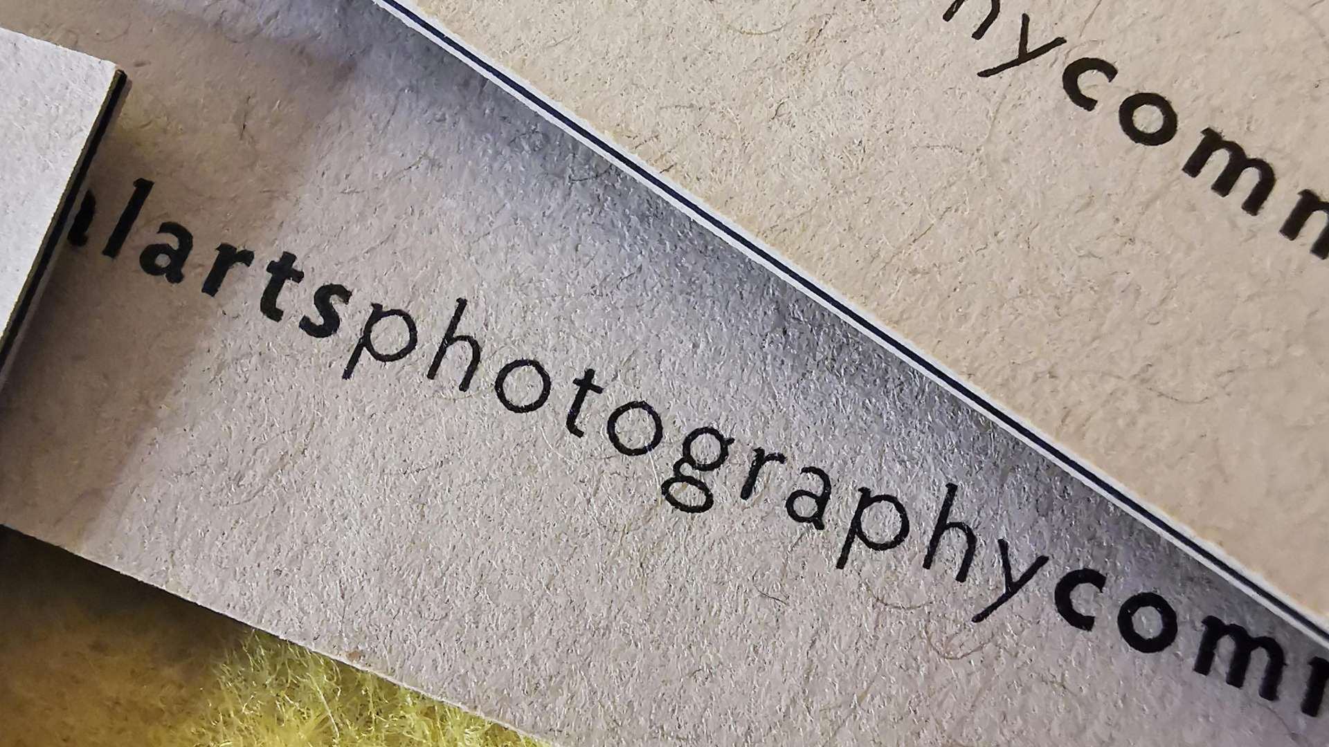
Understanding file formats: Not all logos are print-ready
You might think sending over a JPG or PNG of your logo will do the trick. But here’s what 7 out of 10 clients learn too late: logos need to be in vector format for proper scaling and print clarity.
We’ll guide you through the process of converting your design into a scalable vector file like SVG or PDF, so it retains sharp lines and rich colour whether printed on a small label or a large banner.
Don’t let colour confuse you: Why your brand hue looks off in print
Screen colours are often RGB, but printing uses CMYK, use CMYK and do it right.
Our in-house design team can adjust colours to exact Pantone matches too, ensuring your brand stays consistent across printed materials like training manuals , point of sale elements and promotional items.
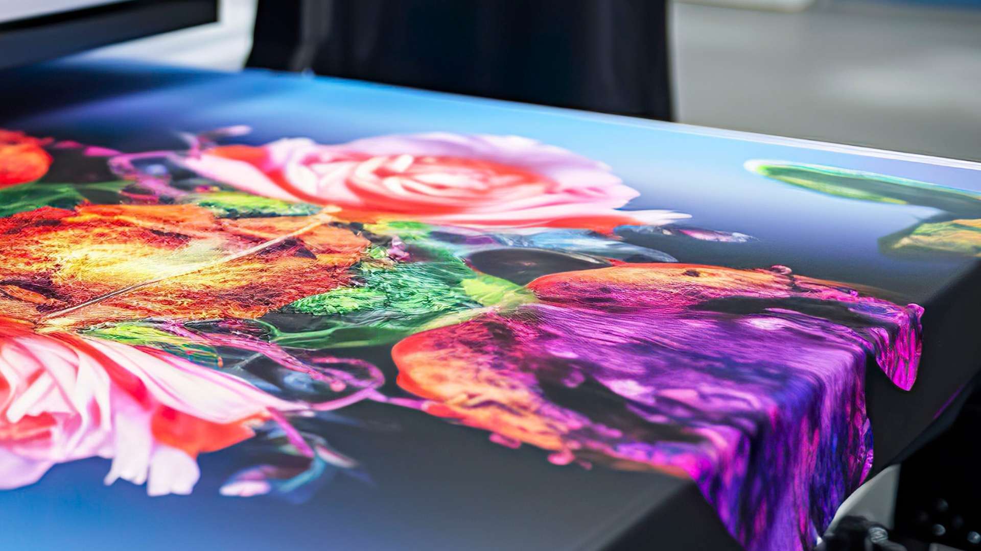
Printing your logo on the wrong material? Here’s what happens
Some materials absorb ink differently, and others don’t handle detailed logos well at all. A vibrant design on vinyl might look dull on matte paper or uncoated paper.
That’s where Print It ZA makes a difference. We’ll help you choose the right substrate to match your logo, from glossy brochures to durable outdoor banners. We also print on educational materials like school textbooks and course books, where logo clarity matters.
Scaling gone wrong: The pitfalls of unchecked sizing
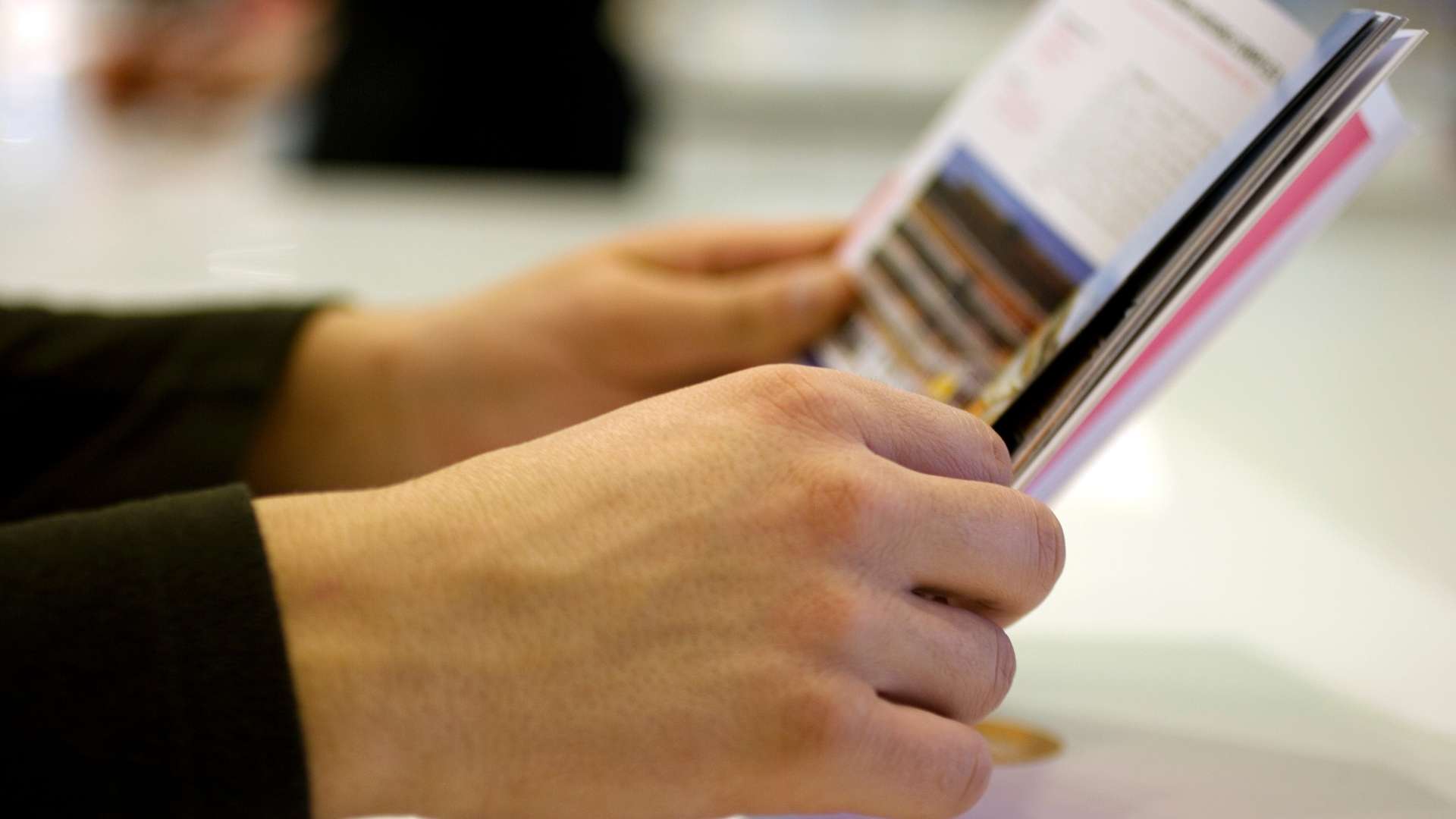
It’s common to resize logos for print without adjusting layout or proportions. This leads to distorted, off-balance designs that look unprofessional—especially in physical formats like booklets or catalogues.
We offer pre-print digital proofs to ensure every size—from business card to A1 poster—preserves your logo’s integrity. You’ll see exactly what it looks like before we hit print.
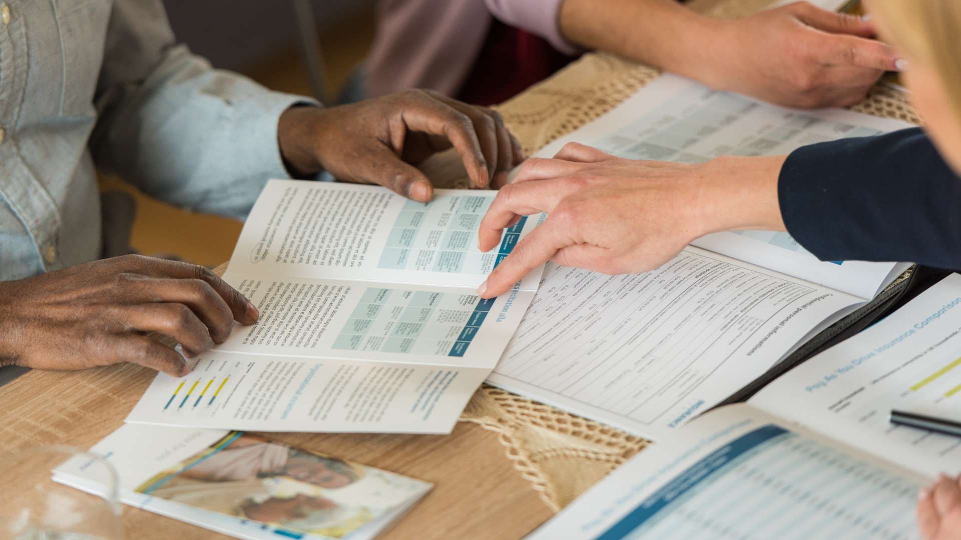
Ignoring the purpose of the print: Where context matters most
Logo printing without a clear objective is one of the biggest regrets businesses have. A logo for signage needs a different finish than one for promotional merchandise or an educational brochure.
At Print It ZA, we ask the right questions. Who is the audience? What’s the environment? What’s the lifespan of the material? This context allows us to recommend finishes, laminates, and materials that match your use case and budget.
What South African businesses often ask before printing logos
How durable is logo printing on outdoor materials?
We use UV-resistant inks and weather-proof finishes to ensure your logo lasts on banners, signage, and vehicle decals across South Africa’s diverse climate zones.
Can you print my logo on recycled paper or eco-friendly stock?
Absolutely. Sustainability is at the core of our services, including for education printing. We offer a wide selection of environmentally responsible materials for your brand.
Do you offer logo design support?
Yes. If your logo needs tweaks before printing—or if you’re starting from scratch—we offer in-house design assistance to make sure your logo prints perfectly.
Focus on the details: Why typography and spacing matter in logo printing
It’s easy to overlook spacing and font thickness when sending a logo to print. But what looks fine on screen may bleed or appear cramped in print, especially on textured paper or fabric.
We review every element—line weight, spacing, font clarity—to make sure your logo pops, no matter where it lands.
The power of placement: Your logo shouldn’t just “be there”
Strategic logo placement can elevate a design from average to unforgettable. Whether it’s top-centred on a brochure or tastefully embossed on a hardcover manual, placement affects perception.
Our team helps you visualise the best spots for your logo to create balance, brand presence, and aesthetic appeal—across everything from training guides to student textbooks.