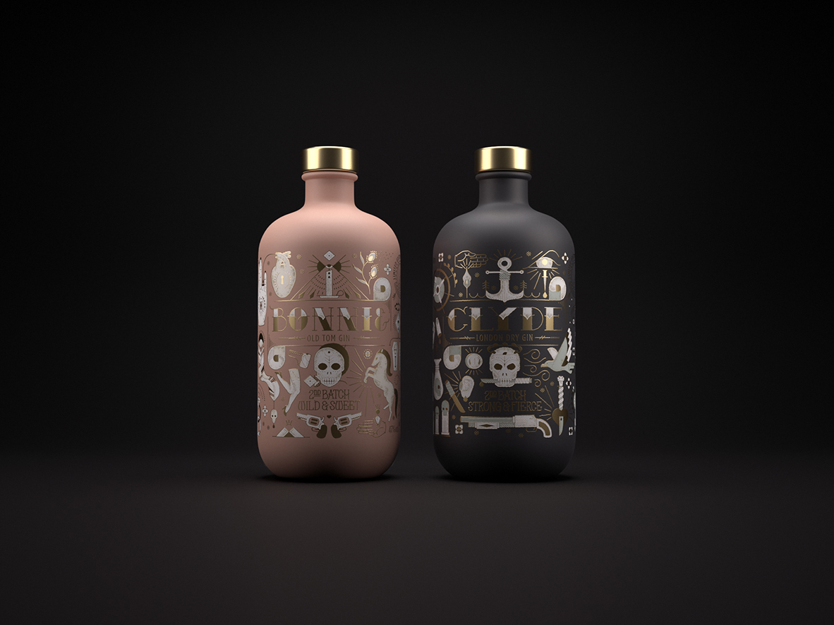
You’ve heard of Bonnie and Clyde, the notorious criminals of the early 1900s. However, the reason we like Bonnie & Clyde Gin is because it focuses on a different part of the Bonnie and Clyde story—that is, a focus on these two individuals who were young and in love. We spoke with Simone Hodgskiss of Pearly Yon about telling the story of Bonnie and Clyde in a different way, designing to emphasize human characteristics, and how a project is never complete until it’s printed.
Walk us through the design process that you went through for this project.
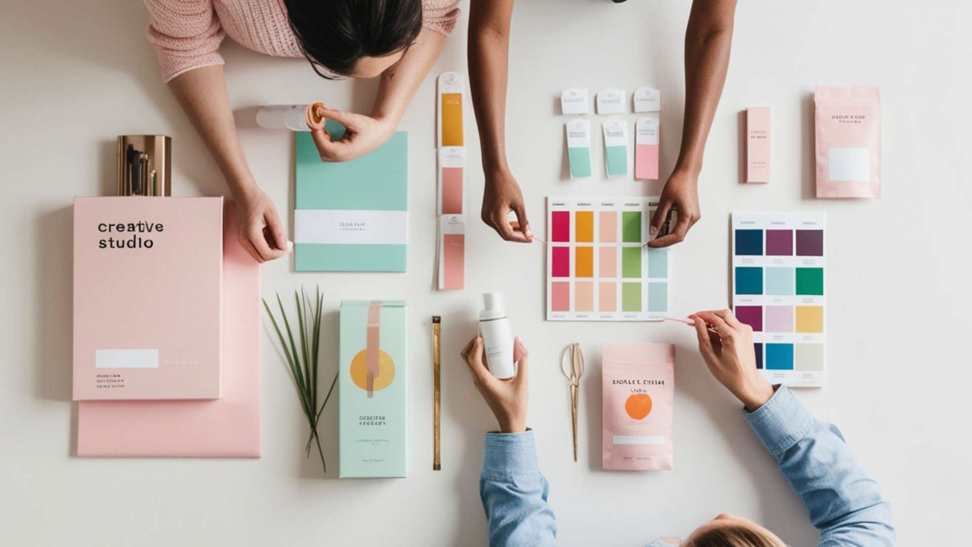
Pearly Yon: I always begin the process by researching. In this case it was the history of Bonnie and Clyde. I jot down potential ideas along the way so that I am able to present a few directions/concepts to the client on first presentation. Upon approval of a route I then progress to penciling rough design on paper. Sometimes I present the rough sketches to clients and sometimes it’s better to present the vector artwork to them. This all depends on which execution supports the concept in the strongest way to help the client understand where the finished design will end up.

What was one of the biggest goals you set out to achieve with Bonnie & Clyde Gin packaging and how did you accomplish it?
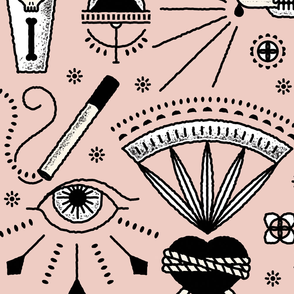
Pearly Yon: My biggest goal was to paint the story of Bonnie and Clyde in a romantic light. Their story is usually depicted as outlaws with guns but after a bit of digging into their past I found other aspects of their character to base their story on. I achieved this by showing their tale through tattoo inspired symbolism.
Although both bottles have similar styles, they both exude the different personalities of each spirit. How did you go about accomplishing this?
Pearly Yon: The symbolic icons I created for Bonnie were softer and more feminine than the abrupt and possibly disturbing icons I created for Clyde. Although Clyde came from a very loving family he was hardened by the harsh judgement and treatment brought on him by his fate. In Bonnie’s case, she was a bright student with a promising future in creative writing, her free spirit encouraged her to quit school and live on the wild side.


What was the most challenging part of this project?
Pearly Yon: After the success of the first batch of Bonnie & Clyde I was now faced with the task of revisiting the same theme but in a new way. I had to find a new approach, a new hook to make the same idea great, again. It was a challenge but lucky for me the theme is a great one.
If you could pick one aspect of the finished design that you like the most or feel especially proud of, what would it be and why?
Pearly Yon: I enjoy the fact that I’ve created symbolic icons to represent aspects of the Bonnie and Clyde’s love story. Each icon has a specific meaning or reference to Bonnie and Clyde’s past. Some of the icons are easy to interpret and some are a bit more cryptic but they are all relevant to the story.
Share one lesson that you learned while developing the finished product.
Pearly Yon: I should know this by now but it always amazes me that the final design, finishes, and colours are never final until they have been printed.

