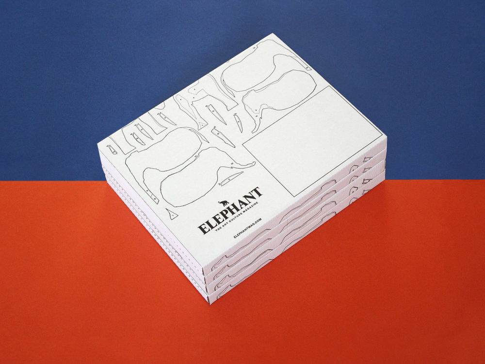
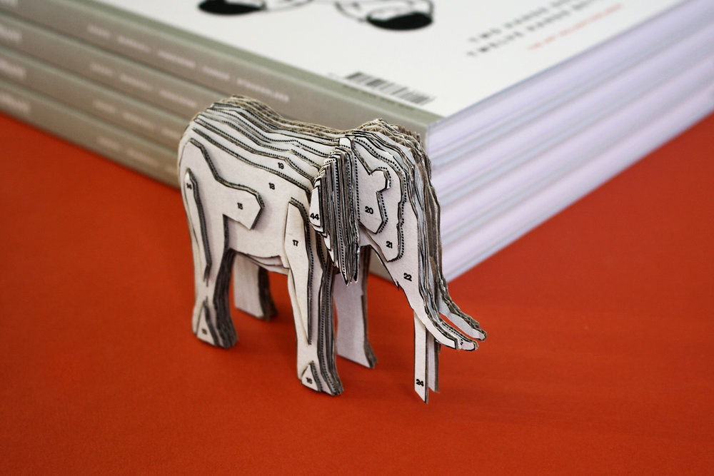
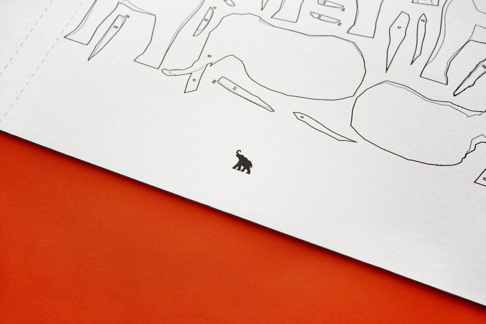
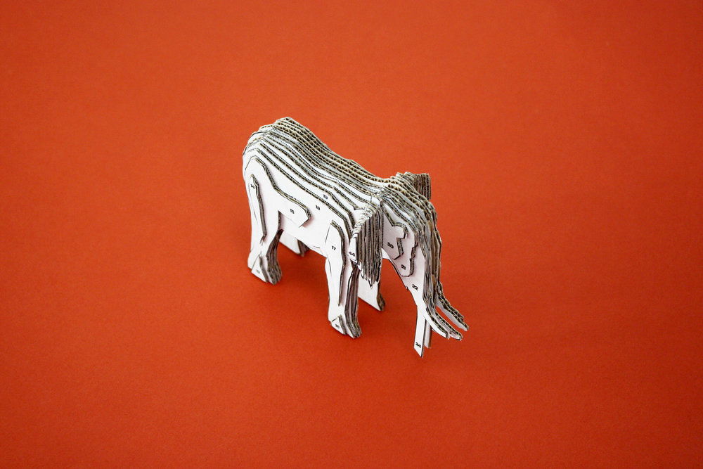
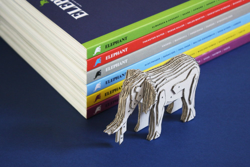
When you get a magazine in the mail, you’re usually most concerned with turning those first few pages and getting into the articles. But Kind Studio used packaging as an opportunity to extend the brand for Elephant Magazine. Instead of opening the box and tossing it, you’re able to make something from it—adding an interactive and simply fun element into receiving a new magazine in the mail.
“Elephant Magazine asked us to redesign their magazine mail packaging. Packaging is great opportunity to include flourishes or elements which add an extra dimension to design. With Elephant we wanted to take full advantage of this, creating something which not only reflects the playful, creative nature of the magazine, but is also a practical packaging solution. People receive their magazine well protected and can then build an elephant from the otherwise wasted material.”
Designed by: Kind Studio
Country: United Kingdom
City: London
SOURCE: https://thedieline.com/blog/2017/1/16/elephant-magazine-has-packaging-you-wont-want-to-toss
