A flyer has about three seconds to do its job. Someone picks it up, glances at it, and decides whether it is worth their attention or the nearest bin. In those three seconds, the design either communicates something clear and compelling or it does not.
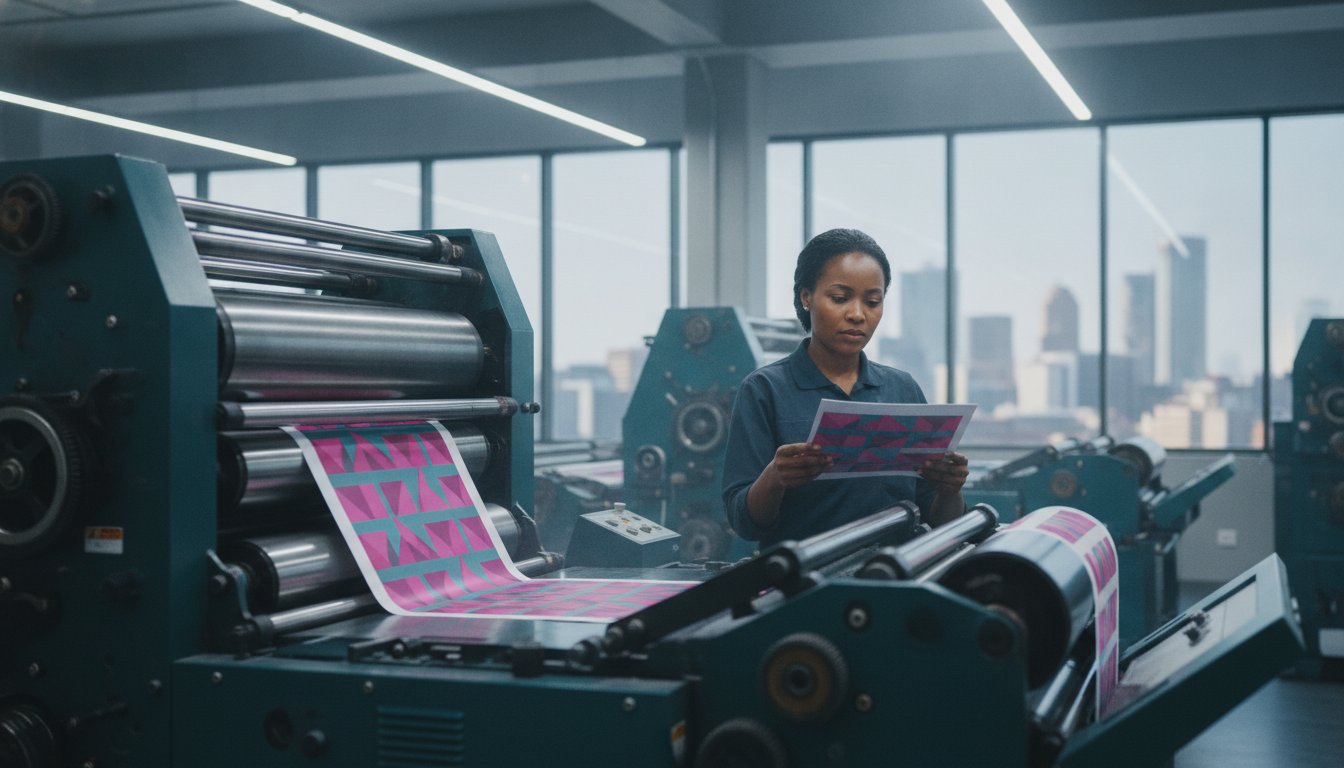
At Print It ZA, we print thousands of flyers every week for businesses across South Africa. We see what works and what does not in the actual printed pieces that land in people’s hands. This guide shares what we have learned, so that the next flyer you print does the work you need it to do.
Start With One Clear Objective
The most common design mistake in business flyers is trying to communicate too much. A flyer that promotes a sale, lists every product, explains the company history, and includes three different contact methods is not communicating; it is overwhelming.
Before you open any design software, answer one question: what is the single thing you want someone to do after reading this flyer? Visit a website. Call a number. Come to an event. Claim a discount. That one action is your objective, and everything in your design should serve it.
A flyer for a restaurant promotion should make you hungry and tell you where to go. A flyer for a service business should make you feel the problem they solve and give you a reason to call. A flyer for an event should give you the date, the place, and a reason to be there.
Keep the objective singular. Everything else is detail.
Hierarchy: The Most Important Design Principle You Need to Know
Visual hierarchy is the way a design guides the reader’s eye, from the most important information to the least important. Good hierarchy makes a flyer easy to scan. Poor hierarchy makes it hard to know where to look first.
There are three levels in a typical flyer hierarchy:
Level 1 — The hook: the headline or main visual that grabs attention and makes someone want to look closer. This is your biggest, boldest element.
Level 2 — The key details: the information someone needs to act — the offer, the date, the price, the location. This should be easy to read quickly.
Level 3 — Supporting detail: the additional context — terms and conditions, a brief description, secondary contact options. This is the smallest text and the least prominent element.
If your flyer has five equally prominent elements, it has no hierarchy — and the reader’s eye does not know where to go. Pick one thing to lead with and build from there.
Headlines That Do the Heavy Lifting
Your headline is the most important line of text on the flyer. It needs to do two things simultaneously: capture attention and communicate value.
A weak headline describes what the business does: “Professional Cleaning Services.” A strong headline communicates what the customer gets: “Your Office, Deep Cleaned Before 7am — Zero Disruption to Your Day.”
The difference is specificity and relevance. Speak directly to the person you are trying to reach, address a problem they recognise, and give them a reason to keep reading.
Some headline approaches that work well for business flyers:
The offer headline: “50% Off All Winter Styles — This Weekend Only.” Clear, specific, time-limited.
The problem-solution headline: “Struggling to Find a Reliable Electrician in Johannesburg?” Calls out a pain point immediately.
The result headline: “Increase Your Online Sales by 30% — Book a Free Consultation Today.” Leads with the outcome, not the service.
Choosing Fonts That Work in Print
Screen design and print design are not the same. A font that looks elegant on a computer monitor can become hard to read when printed on 130gsm gloss stock and held at arm’s length.
Limit Your Font Choices
Use two fonts maximum — one for headlines and one for body text. More than two fonts creates visual noise that makes a flyer look unprofessional and hard to follow.
Serif vs Sans-Serif
Sans-serif fonts (like Arial, Helvetica, or Montserrat) are generally easier to read at small sizes and in short blocks of text — ideal for headlines, subheadings, and key details on a flyer. Serif fonts (like Georgia or Times New Roman) can work well for body text but should be used at a size that maintains readability when printed.
Font Size Matters More Than You Think
The minimum readable font size for print body text is 9pt, and 10–11pt is safer for a flyer that will be read quickly. Headlines should be large enough to be read from 30–40cm away without straining. Test this by printing a proof at actual size before finalising your order.
Avoid Decorative Fonts for Important Information
Decorative and script fonts can add personality to a headline, but they should never be used for addresses, phone numbers, or web addresses. If someone has to squint to read your contact details, they will not contact you.
Colour: Using It With Purpose
Colour is one of the most powerful tools in flyer design, and one of the most misused. A few principles that make a real difference in print:
Stick to Your Brand Palette
If your business has brand colours, use them. Consistency between your flyer and your other marketing materials — website, signage, social media — builds brand recognition over time. A flyer that uses completely different colours from everything else you produce creates confusion rather than reinforcement.
High Contrast Improves Readability
Dark text on a light background is easier to read than light text on a light background — obvious in principle, but often violated in practice when designers choose subtle colour combinations that look sophisticated on screen but become illegible in print. Always check your contrast ratios before sending to print.
Colour in Print Is Different From Colour on Screen
Screens display colour using RGB (red, green, blue) light. Commercial printers use CMYK (cyan, magenta, yellow, black) ink. The same design will look different in these two colour modes — sometimes significantly. Bright neon colours, in particular, often cannot be replicated in CMYK to the same vibrancy they have on screen.
Always design in CMYK colour mode if you are creating a file specifically for print. If you are designing in RGB — as you would in Canva or many browser-based tools — be aware that colours may shift slightly when printed, and request a proof if colour accuracy is critical.
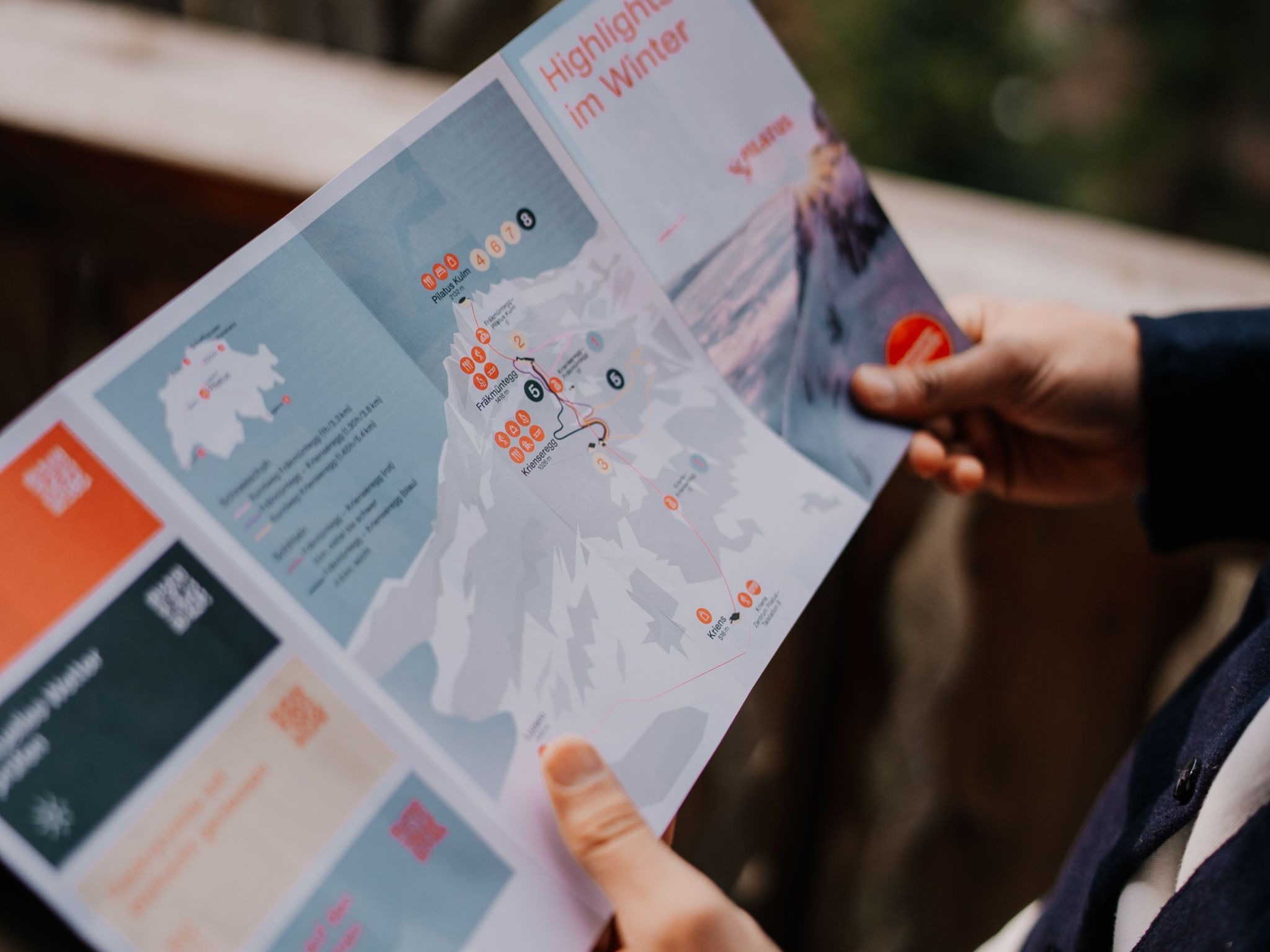
Images: Quality Over Quantity
A single strong image used well is more effective than several mediocre ones competing for attention. The image should reinforce your message — a food flyer with an appetite-inducing photograph of the dish, an event flyer with an energetic crowd photo, a property flyer with a well-shot exterior image.
Resolution is Non-Negotiable
For print, all images must be at least 300dpi at the size they will be printed. Images from the web or social media are typically 72–96dpi — they will print blurry and pixelated at full flyer size. If you are sourcing photography, always download the highest resolution version available. If you are using your own photography, shoot in the highest quality your camera or phone allows and avoid compressing or resizing before uploading to your design file.
Stock Photography Done Right
If you are using stock photography, choose images that feel authentic rather than staged. An overly posed stock photo of smiling office workers does little for credibility. A well-composed image that genuinely relates to your product or service adds real value to the design.
The Call to Action: Tell People Exactly What to Do
Every effective flyer ends with a clear, specific call to action (CTA). Not “contact us for more information” — but “call 010 446 5618 before Friday to claim your discount” or “scan the QR code to book your spot.”
The more specific the CTA, the more likely people are to act on it. Include the contact method that is easiest for your audience — a phone number for older demographics, a QR code for younger ones, a web address for B2B audiences who will follow up from a desk.
If you can add urgency — a deadline, a limited quantity, an expiry date — do it. Urgency is one of the most reliable drivers of response in direct marketing, and a flyer is direct marketing in its most physical form.
Set Up Your File Correctly for Print
Once your design is ready, preparing it correctly for print is the final step that many designers skip — to their cost. Key requirements for a print-ready flyer file:
- CMYK colour mode
- 300dpi image resolution
- 3mm bleed on all sides
- All fonts embedded or outlined
- Exported as PDF/X-1a
For a full technical walkthrough, read our print-ready file preparation guide. If your file is not quite right, our team will flag it before production starts.
Ready to Print Your Flyer?
Once your design is ready, we will take it from there. Our flyer printing service covers A4, A5, and DL formats in gloss or matte finish on 130–170gsm coated stock, with turnaround times that fit real marketing deadlines. We deliver nationwide across South Africa.
If your campaign needs more than flyers, we also print brochures, posters, and business cards — all produced to the same standard and deliverable together.
Call us on 010 446 5618 or email info@printitza.co.za to discuss your order.
Contact Print It ZA today, for a Free Quote and Speedy Service.
Print It ZA print and packaging, we deliver Printing Best!