The best book printer for your project is one that can meet your format, interior and cover requirements. South African authors can compare six book printing companies or services, but the right choice depends on the book you want to produce, not just the printer’s name. Set the trim size early because it affects both the cover and interior layout.
Choosing a printer can feel like a big decision: paper, binding and file preparation all affect the result. This guide explains how to compare book printing services in Johannesburg and across South Africa, avoid common preparation mistakes, choose paper and finishes, and assess a printed proof before approving production. You’ll also find practical ways to check whether a printer’s capabilities suit your book, from a paperback novel to a hard-cover title. With the key decisions clear, you can move from manuscript to a polished printed book with greater confidence.
Key Takeaways
- Supply print-ready PDFs for the interior and cover, and have the pages professionally typeset rather than printing directly from a Word document.
- Choose cream paper for fiction and white paper for academic or other non-fiction books.
- Use black-and-white printing where colour isn’t essential, and consider how ink and cover finish affect the book’s look.
- Review a physical sample for readability, alignment, paper feel and binding before approving a larger print run.
- Compare printers by how well their capabilities match your book’s format and production requirements.
1. Who are the best book printers in South Africa?
There isn’t one best printer for every South African book project. A useful shortlist compares six South African book printing companies or services against your format, quantity, files and delivery needs. Start with the finished book, then assess which printer can produce it to your specifications.
Choose your trim size before finalising the interior and cover design. Trim size is the book’s finished height and width, and changing it later can affect page layout, margins and cover dimensions. A compact novel and a large illustrated book have different layout needs. Give the chosen dimensions to your designer and printer before preparing the final files.
Digital printing transfers each page from a digital file, making it suited to flexible production and smaller quantities. Litho printing uses printing plates and can suit larger runs. Compare the methods against your quantity, colour requirements, schedule and desired consistency. The best fit depends on your project, not the method’s name alone.
When comparing quotes, make sure they cover the same specifications. Check trim size, page count, paper, colour, binding, cover finish, proofing, quantity and delivery destination. A quote for a paperback with a black-and-white interior isn’t directly comparable to one for a hard-cover book with colour pages. Ask for any assumptions to be clearly stated in the quoted scope.
In South Africa, ISBN, copyright and legal deposit are separate publishing considerations. An ISBN identifies a book edition, copyright concerns ownership and use of the work, while legal deposit relates to copies supplied to designated institutions. Consider these obligations when preparing a book for publication, rather than treating them as printing specifications.
There is no single minimum order quantity for every printing method and book specification. The practical quantity depends on factors such as format, page extent, colour and production method. Compare the total quantity you need with the proposed production approach, and consider whether you need copies for sales, events or distribution.
Printers can produce different trim sizes and paper choices, as well as paperback and hard-cover formats. Cream paper is commonly recommended for fiction, while white paper suits academic and other non-fiction titles. The available combination depends on the book’s design and production requirements. Confirm the exact specifications before approving files.
To get a book printed, settle its trim size, complete editing, prepare the interior layout and cover, then supply print-ready PDFs. Review a proof or sample before approving production. Printing and delivery time depend on the quantity, specifications, file readiness and destination. Include those factors when planning a release date.
Confirm the exact specifications before approving the final files, particularly the trim size. Decide the finished height and width early, then make sure the interior layout and cover are prepared for those dimensions. If the size changes after design work is complete, the page layout, margins and cover dimensions may need to change too. Sharing the chosen dimensions with your designer and printer helps keep the production brief aligned with the book you intend to make.
2. Common self-publishing and printing mistakes
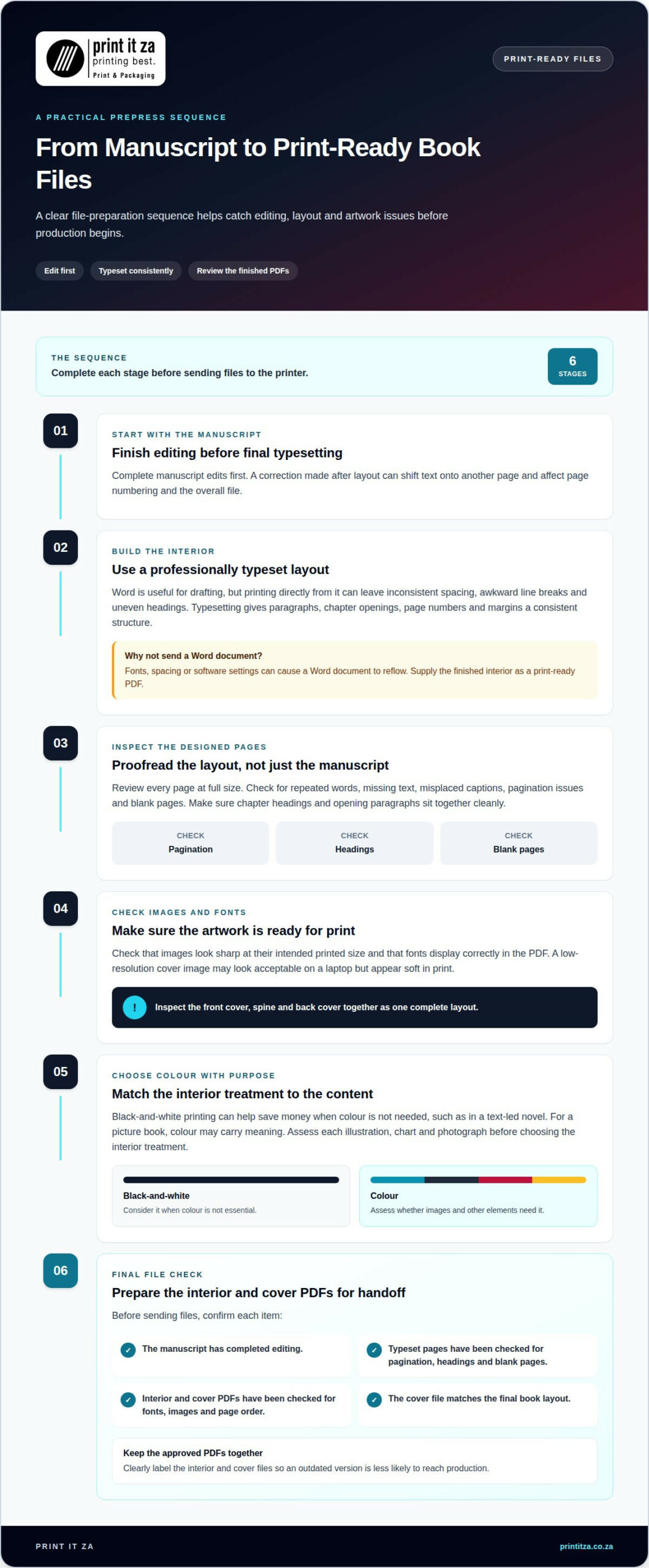
A polished manuscript can still produce a disappointing book if its files aren’t prepared for print. Common problems include sending an editable Word document, overlooking layout errors and choosing colour without considering its purpose. A careful prepress routine catches these issues before production begins.
Start with the interior file. Supply a print-ready PDF to help preserve the page layout across devices and software. A Word document can reflow when fonts, spacing or software settings differ. Export the final layout to PDF, then review every page at full size before sending it to a printer.
Don’t treat a word-processed manuscript as a finished interior. Microsoft Word is useful for drafting, but printing directly from it can leave inconsistent spacing, awkward line breaks and uneven headings. Professional typesetting gives paragraphs, chapter openings, page numbers and margins a consistent structure. For example, inspect a chapter that starts near the bottom of a page and check whether its heading and first paragraph sit together cleanly.
Editing is another essential step. A spelling correction made after layout can shift text onto another page, affecting page numbering and the overall file. Complete manuscript edits before final typesetting. Then proofread the designed pages, not just the original document, because layout can reveal repeated words, missing text or misplaced captions.
Images and fonts need attention too. Check that each image looks sharp at its intended printed size, and ensure the fonts display correctly in the PDF. A low-resolution cover image may look acceptable on a laptop but appear soft in print. Inspect the front cover, spine and back cover together as one complete layout.
Colour can add unnecessary complexity when it serves no clear purpose. Black-and-white printing can help save money when colour isn’t needed, such as in a text-led novel. For a picture book, colour may carry meaning, so assess every illustration, chart and photograph before choosing the interior treatment. Don’t assume colour improves every page.
Before submitting files, use a final checklist:
- Confirm the manuscript has completed editing.
- Review the typeset pages for pagination, headings and blank pages.
- Open the interior and cover PDFs to check fonts, images and page order.
- Make sure the cover file matches the final book layout.
Keep the approved PDF files together and clearly label the interior and cover. Replacing an old file with a revised one can prevent an outdated version from reaching production. If you’re preparing a manuscript for print, explore book printing options as you turn the final files into a finished book.
Keep your files organised. Before printing, complete editing, cover design and interior layout, and plan how the book will be distributed.
3. Paper colour and thickness
Paper affects how a book looks, feels and reads. Cream paper is often recommended for fiction because its softer tone suits long passages of text. White paper is a common choice for academic and other non-fiction books, where crisp contrast can support diagrams, tables and detailed text. Treat these as starting points, then match the stock to the book’s content.
Think about the reader’s experience. A novel with page after page of text may feel comfortable on cream stock, while a workbook with charts may benefit from white pages. For a photography-led title, consider how the chosen paper will reproduce images and maintain contrast. The same paper choice won’t suit every project, even within the same genre.
Paper colour and thickness describe different qualities. Colour refers to the paper’s visible shade. Thickness describes how substantial an individual sheet feels, while paper weight relates to its mass. Printers may discuss these specifications separately, so compare like with like rather than choosing by a single label. For example, two stocks can look similarly white but feel different in hand.
Interior stock also affects the finished book’s overall feel and thickness. A thicker sheet can make pages feel more substantial, but the complete book will also become bulkier. That can affect handling and the cover’s spine dimensions. A lighter sheet may keep a long, text-led book more manageable. Consider page count and binding together when selecting stock.
Opacity matters when text or images are printed on both sides of a page. If the sheet allows too much show-through, dark text or illustrations on the reverse may distract from reading. This can be especially noticeable in books with dense text, large images or heavy ink coverage. Review representative spreads, including pages with the darkest content.
Use the book’s purpose to guide your choice:
- Fiction: Compare cream stock for a softer reading appearance.
- Academic or non-fiction: Assess white stock for text, tables and diagrams.
- Illustrated titles: Consider colour reproduction, opacity and image detail.
- Long books: Balance sheet feel against the bulk of the finished volume.
Before approving production, compare paper options under consistent lighting and review printed text and images. Check how the page feels when turned, whether content shows through and whether the stock suits the book’s binding. If a title combines prose with illustrations, assess both types of pages. Record the selected paper colour and specification in the final production details so the design and printing stay aligned.
4. Paperback ink and cover finish choices
Ink and finish shape a paperback’s first impression and reading experience. Start by separating interior printing from cover treatment. A text-led novel may need black-and-white pages and a distinctive cover, while an illustrated guide may rely on colour inside. Choose each element according to the content it needs to communicate.
Black-and-white interiors suit books where colour doesn’t add meaning. They keep text clear and avoid printing colour across every page. A novel, memoir or text-heavy manual often works well this way. Colour interiors make sense for children’s stories, illustrated recipes or books where charts depend on colour. Review each spread and identify where colour genuinely helps.
Don’t choose full-colour printing automatically. A single coloured diagram may be redesigned in shades of grey if its labels and distinctions remain clear. Conversely, a photograph or colour-coded instruction may lose important detail in monochrome. Compare representative pages in both treatments before setting the interior specification. This helps match the ink choice to the book’s purpose.
Paperback covers also need a finish that suits the artwork and how readers will handle the book. A matte finish has a subdued appearance that can complement muted colours or a text-led design. A gloss finish creates a more reflective surface, helping bright artwork appear vivid. The visual difference is most apparent on large areas of colour and photographs.
Consider the cover’s details before choosing a finish. Fine text, dark backgrounds and pale lettering may look different under reflective light. A glossy surface can catch reflections, while a matte surface can make colours appear less shiny. For example, a photographic travel book may call for a vivid look; a literary novel might suit a quieter presentation. Judge the finish alongside the actual cover design.
Use this practical sequence to make the choice:
- Review the content: Mark pages where colour carries information.
- Choose interior ink: Compare black-and-white pages with colour where needed.
- Assess the cover artwork: Consider photographs, large colour fields and small text.
- Compare finish samples: View matte and gloss examples under ordinary reading light.
Keep production details consistent. The cover file should reflect the selected finish and final design, while the interior file should match the chosen ink treatment. If a design combines colour illustrations with black text, make clear which pages require colour. That distinction helps prevent a mismatch between the intended appearance and the printed paperback.
Finally, consider the book as a complete object. Pairing a subdued cover with a vivid interior can create a deliberate contrast, while bright cover artwork and colour pages may give an illustrated title a more unified look. Check the cover alongside several representative interior pages, not in isolation. A considered combination makes the paperback’s visual style feel coherent from cover to final page.
5. Requesting a printed sample copy
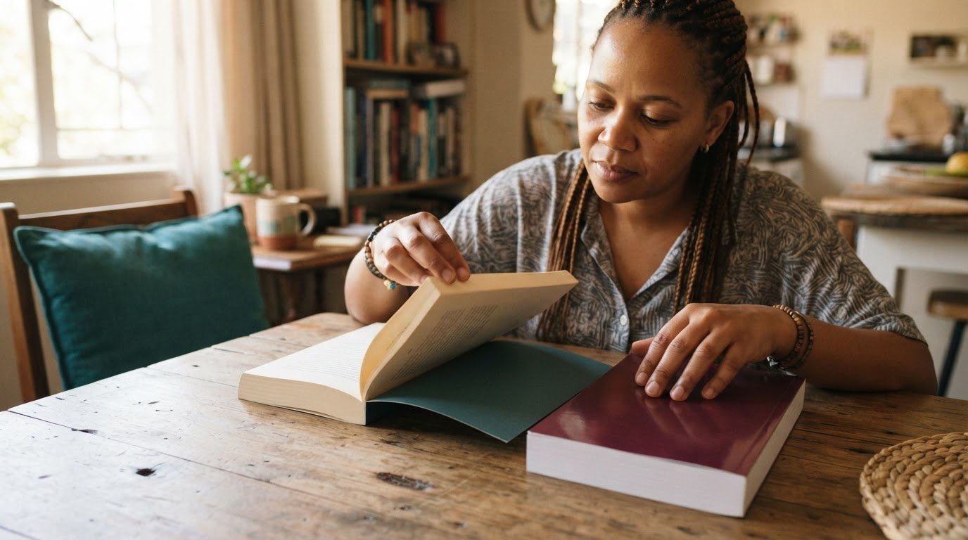
A printed proof lets you assess a physical book before approving a larger print run. A screen can’t show the paper feel, binding, colour or finish exactly as they appear in hand. Treat the proof as a production check, not simply a preview of the cover. Use it to identify changes while they’re still practical to make.
Prepare the final interior and cover files before requesting a proof. If it uses an earlier layout, its page flow may differ from the book you intend to print. Confirm that the trim size, page order, paper choice, ink treatment and cover finish match your intended specification. For example, a proof with a different paper stock can’t accurately show how the final pages will feel.
Examine the proof in ordinary reading light. Check whether body text feels comfortable to read, headings stand out clearly and page numbers appear in the correct places. Look at image detail and colour reproduction, especially on pages with photographs, charts or illustrations. For a novel, inspect several consecutive text pages; for an illustrated title, review spreads with varied image content.
Assess the physical construction as well as the printed pages. Open the paperback and check that it sits comfortably in your hands. Look for a straight cover, clean trimming and pages that turn without catching. Check that the spine text is centred and readable, and that the front and back covers align with the finished book.
Use a simple review sequence to keep feedback specific:
- Check the files: Confirm the sample reflects the final interior and cover PDFs.
- Review the pages: Inspect text, images, page order and visible alignment.
- Assess the materials: Compare paper colour, thickness, ink and cover finish against your intended choices.
- Record revisions: Note each correction by page or cover area before approving production.
Separate preference changes from production errors. You might decide that a cover colour feels too muted or spot a missing page number. Record each point clearly, then update the relevant file and review the revised proof. Keep the approved version distinct from earlier drafts to avoid sending outdated artwork into production.
Request the paid sample before committing to a larger run, and allow time to assess it and make any needed file changes. The sample is especially useful when the cover finish, paper or image reproduction matters to the book’s appeal. Arrange a printed book sample to evaluate your pages and cover in physical form before moving ahead.
Print It ZA print and packaging
Print It ZA provides Book Printing using litho and digital printing. Its in-house team supports creative development, helping authors move from prepared artwork towards finished books. This is a practical next step once you’ve settled your format, paper and cover choices and are ready to produce a printed edition.
For a project that needs coordinated support, discuss the book’s specifications, artwork and intended outcome with the team. Print It ZA also produces catalogues, brochures and retail packaging, supporting a range of print requirements under one roof.
Contact Print It ZA print and packaging to discuss your book project.
Take the next step towards your finished book
Your first print run can also set a useful foundation for future editions. Keep a record of the final artwork, selected materials and approved production details. If you revise the manuscript later, those decisions can help you plan updates without rebuilding the project from scratch. A clear publishing workflow gives your next book a stronger starting point, too.
Choose book printing services that fit the project you’re ready to produce, whether you’re preparing a first edition or developing a publishing catalogue. Print It ZA print and packaging offers books, catalogues and brochures, helping you consider related printed materials alongside your book project.
Bring your project details and questions together, then take the next step at a pace that suits your plans. Contact Print It ZA print and packaging about your book project to start the conversation. Your finished book begins with a clear idea and a practical plan, and you’re ready to move yours forward.
Frequently Asked Questions
Who are the best book printers in South Africa?
The best choice is a printer whose production capabilities fit your book and intended audience. South African authors can compare six book printing companies or services, then narrow their options by format, print method and project requirements. Print It ZA provides Book Printing with litho and digital methods. Consider whether its capabilities suit your edition, from a novel to an illustrated title.
What book printing services are available in South Africa?
South African book printing services produce paperback and hard-cover books, novels, children’s books, school books and other titles. Print It ZA also produces books, catalogues and brochures. For example, an author preparing a standalone novel has different needs from an organisation producing books alongside catalogues. Define the finished material and its intended use first, then choose the relevant printing approach and specifications.
Which book printers serve Johannesburg, Cape Town, and other South African cities?
Book printers serving South African cities may operate locally or deliver printed work across the country. Print It ZA is based in Gauteng and focuses on Johannesburg, with delivery available across South Africa, including Cape Town. When planning a project from another city, include the destination and delivery requirements alongside the book specifications. This helps align production planning with where the finished copies need to go.