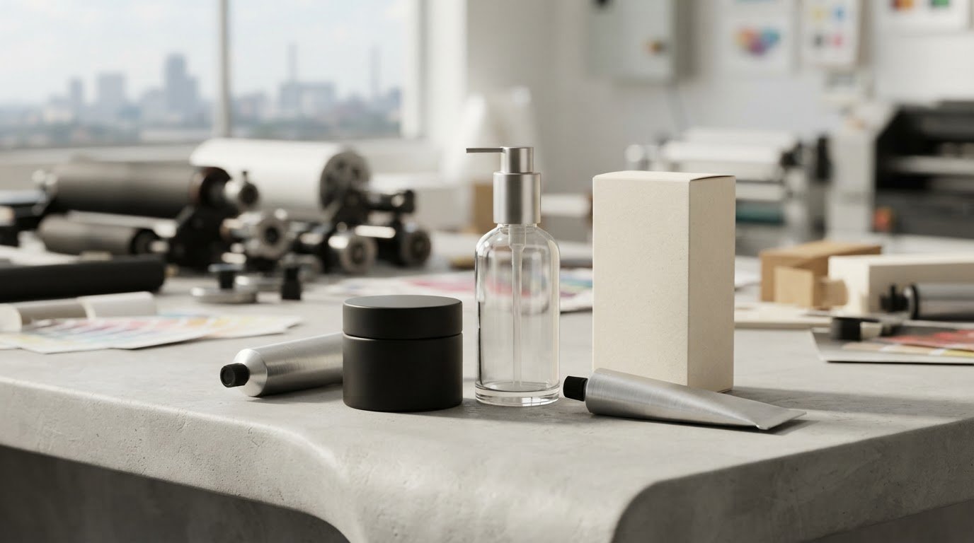
A package can look beautiful and still miss its mark. Effective cosmetic product packaging design brings product protection, function, aesthetics and brand identity together. A clear focal point helps customers notice the key message first, while colour and visual details shape their impression of the product.
Packaging needs to look appealing, but it must also explain what the product is and make essential information easy to find. The challenge is to decide what deserves attention first and make every design choice support that priority.
This guide explains what packaging design means and how to build a strong focal point, choose colours that fit your brand, and consider current trends such as minimalist layouts, transparent packaging and refill systems. You’ll also see how these choices work together, so your packaging feels distinctive, clear and suited to the product.
Key Takeaways
- Start with the intended customer and brand personality so packaging choices feel relevant and recognisable.
- Give the design one clear focal point to guide attention towards the most important message.
- Choose colours for their fit with the product and brand, not simply because they’re fashionable.
- Consider minimalist layouts, transparent packaging and refill systems, while weighing their practical trade-offs.
- Compare materials such as glass, aluminium, paperboard and recycled plastics with the product’s needs and sustainability goals.
What is packaging design?
Cosmetic product packaging design brings together the container, its graphics and the information customers see. The packaging should suit the product, reflect the brand and make its use clear. For example, a skincare bottle and its printed label should feel like parts of one identity, not unrelated choices.
Begin with your target customer. A brand aimed at makeup beginners might prioritise clear shade names and easy-to-read instructions. A premium skincare brand may use restrained typography and a simple colour palette. Before creating artwork, use a mood board to bring together images, colours and advertising that express the brand’s personality.
Choose each design element for a reason. A product name, benefit or distinctive image can lead the eye, while supporting details remain secondary. AI tools can help generate visual directions or adapt image crops for a label mock-up. Treat these as drafts, then check accuracy, legibility and brand fit before preparing final artwork.
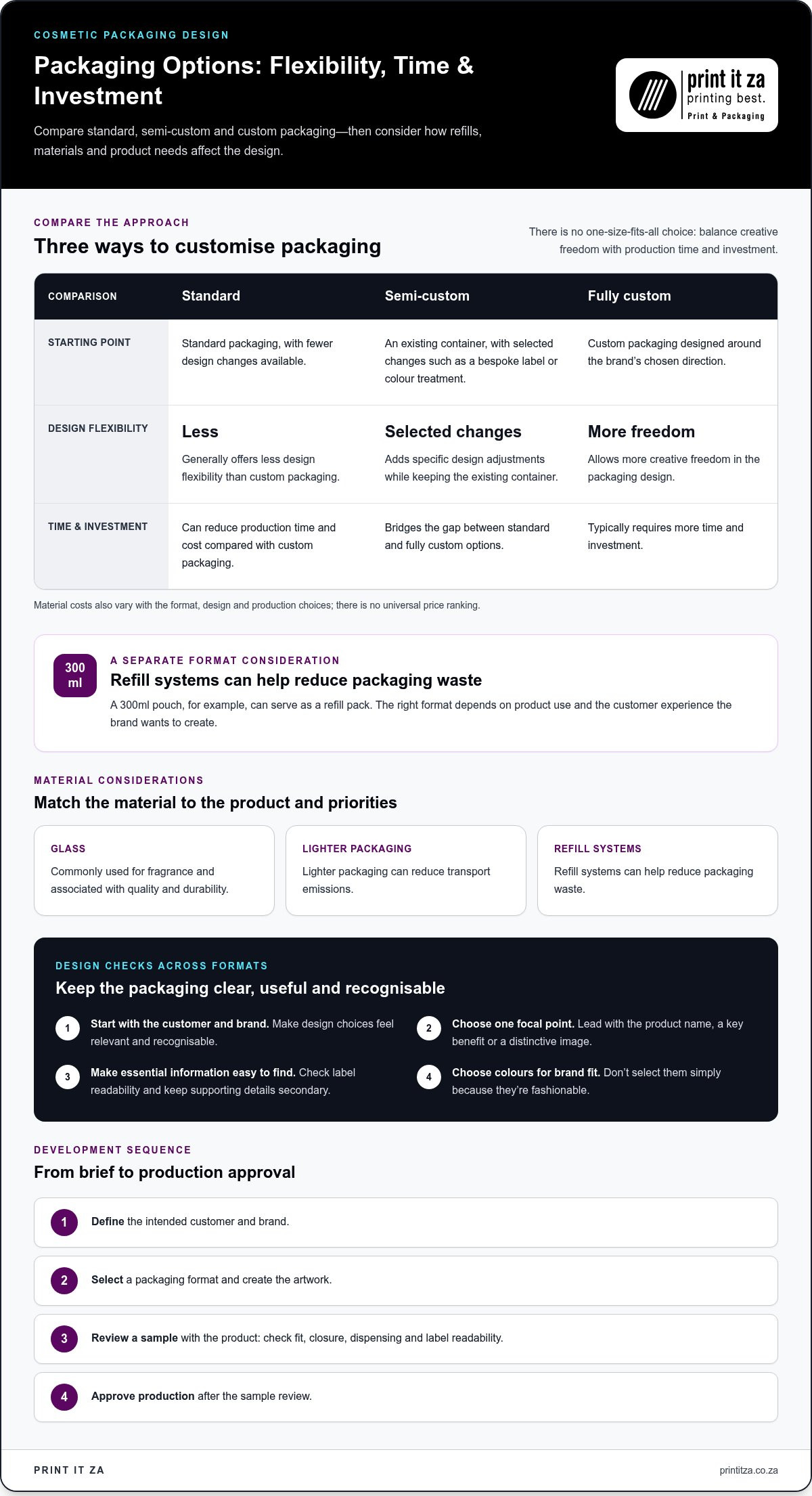
Customising a design can mean adjusting colours, typography, label dimensions or graphics to suit a brand. Standard packaging generally offers less design flexibility, but can reduce production time and cost compared with custom packaging. Custom options allow more creative freedom, while typically requiring more time and investment.
Semi-custom packaging uses an existing container with selected design changes, such as a bespoke label or colour treatment. It can bridge the gap between standard and fully custom options. Refillable formats add another consideration: a 300ml pouch, for example, can serve as a refill pack and reduce packaging waste. The best format depends on product use and the customer experience the brand wants to create.
How do glass, plastic, metal, and refillable cosmetic packaging compare in cost and performance? Material costs depend on the format, design and production choices, so there is no universal price ranking. Glass is commonly used for fragrance and associated with quality and durability. Lighter packaging can reduce transport emissions, while refill systems can help reduce packaging waste.
What labeling and packaging rules apply to cosmetics in South Africa? Cosmetic packaging must meet applicable South African requirements, which can vary depending on the product and its claims. Keep label content accurate and avoid unsupported claims.
What information must appear on cosmetic product labels in South Africa? Make the product identity, ingredient information, directions and relevant cautions clear and easy to read. Exact legal label requirements depend on the product category and applicable rules.
How do you design packaging that protects product quality and prevents contamination? Match the container and closure to the product’s intended use, then assess how dispensing, storage and handling affect exposure. For example, a pump format may limit direct contact compared with an open jar.
What are the steps for developing and testing cosmetic product packaging? Define the customer and brand, select a format and create the artwork. Then review a sample with the product, checking fit, closure, dispensing and label readability before approving production.
What are common cosmetic packaging design mistakes and risks? Common problems include crowded labels, weak contrast, hard-to-read instructions and containers that don’t suit the product’s use. Reviewing final artwork and a sample can help catch these issues before production.
Choosing a focal point for packaging design
A focal point gives the eye a clear place to land. On a serum carton, it might be the product name, a distinctive ingredient or a strong graphic. Choose the element that best explains why the product matters. Keep supporting details, such as directions and brand copy, visible without letting them compete for equal attention.
Start by writing the main message in a short phrase. A cleanser might lead with its product type, while a moisturiser could foreground its key benefit. Then identify the customer’s likely first concern: the product’s purpose, the brand or a specific feature. The focal point should answer that concern quickly.
Build a visual hierarchy around that priority. Use scale, position, contrast and whitespace to set the leading element apart from secondary information. A larger product name can lead, with the brand mark and supporting copy nearby. Avoid making every line bold or brightly coloured, as this removes the contrast the focal point needs.
Check the design in context, not only on a large screen. A package displayed beside competing products needs a recognisable silhouette, colour block or graphic. An online thumbnail has less room for detail, so test whether the product name and main visual remain legible when reduced. Keep small supporting text out of the focal area.
Consistency matters across a product range. If a skincare line uses different colours for cleanser and moisturiser, shared typography or graphic placement can maintain brand identity. This helps customers recognise related products while distinguishing their uses. On each package, avoid decorative elements that suggest a benefit the product doesn’t provide.
What packaging design features help cosmetics stand out on retail shelves and online? A distinctive product name, strong contrast, recognisable colours and a simple graphic can improve visibility in both settings. Test the layout as a shelf-facing package and a small online image, then adjust scale and detail for each view.
Before finalising artwork, print a mock-up at its intended size. Check the focal point from arm’s length and on a phone screen. Is the product type immediately clear? Is the brand mark recognisable, and is the secondary copy legible? If elements compete, remove or reduce details instead of adding decoration.
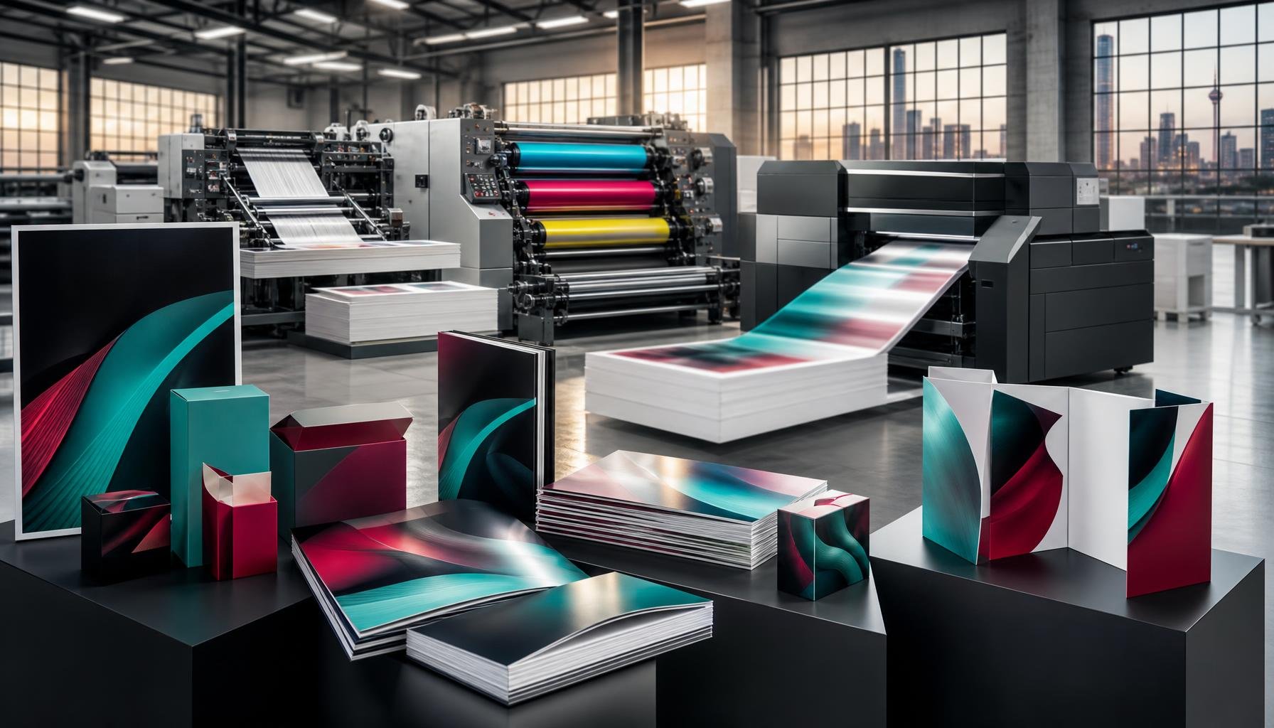
For a clearer view of how artwork translates to a finished package, explore these printed packaging design considerations as part of your next design review.
Colour choices for makeup and skincare
Colour helps customers recognise a product, understand its place in a range and form an impression of its personality. A makeup brand might use vivid shades to make colour cosmetics feel expressive, while a skincare range could use quieter tones for a clean, restrained look. These are design choices, not fixed meanings. Connect each colour to the brand’s audience and identity.
Start with the product itself. A lipstick package can echo the shade inside, making the colour easy to identify. A moisturiser carton might use a consistent base colour across the range, with a different accent to distinguish formulas. This creates a family resemblance while helping customers tell products apart on a shelf or in an online image.
Give each colour in the palette a clear role. Choose a primary colour for recognition, a supporting colour for structure and an accent for details such as the product name. A pale background with dark type, for example, can make essential copy easier to read. Strong contrast is especially important where customers need to find the product name or instructions quickly.
- Makeup: Use shade cues that match the product, such as a warm accent for a coral blush. Keep the brand mark consistent across the colour range.
- Skincare: Pair a restrained base with one distinctive accent. A cleanser and moisturiser can share the same base while using separate accent colours.
- Product variants: Keep typography and layout stable, then change one colour cue. Customers can recognise the range without confusing one formula with another.
- Online thumbnails: Check that the main colour and product name remain clear at reduced size. Fine colour differences may disappear on a small screen.
Colour also depends on the printed surface. A shade may look different on uncoated paper, glossy stock or transparent packaging. Before approving final artwork, review a printed proof on the intended material. Compare it under the lighting customers will encounter and check that small text contrasts with its background.
For a practical palette review, place the design beside competing products and view it as a small online thumbnail. Ask whether the product category, variant and brand are easy to distinguish. In cosmetic product packaging design, a controlled palette usually works harder than extra colours added without a clear purpose.
Current cosmetics packaging design trends
Minimalist layouts and transparent packaging are prominent cosmetics packaging trends. Minimalism uses fewer visual elements, giving the product name and essential copy room to breathe. Transparent packs let customers see the product itself. Each approach needs a clear purpose: a simple label should still communicate the product type, and the visible formula should suit the container and brand.
For a minimalist design, remove decorative elements that don’t help customers identify or understand the product. Keep the product name, brand mark and key details easy to find. With transparent packaging, consider how the product’s colour works beside the label. A pale lotion, for example, may need stronger text contrast than a darker serum.
Packaging size can signal how and when a product is used. A 5ml serum or 10g powder can suit travel or trial use, while 30ml lotions and 100ml cleansers are examples of daily-use sizes. A 500ml pump bottle can suit longer-term or family use. These formats let brands address different needs within one product range.
Specialty finishes add another design layer. Foil-stamping can highlight a logo or product name, while embossing adds raised detail customers can feel. These treatments can create a more luxurious impression, but work best when used selectively. A foil logo on a restrained carton can feel intentional; several competing effects may overwhelm the design.
Sustainability-focused choices include plant-based inks, reducing unnecessary packaging and introducing refill systems. A 300ml pouch can function as a refill pack. Consider the complete format, not just the printed surface: a refill option should make the product straightforward to replenish, and excess outer packaging can undermine a reduced-material approach.
- Minimalism: Keep only design elements that clarify product identity or use.
- Transparency: Make sure visible contents work with label contrast and layout.
- Size variety: Match formats to travel, trial, daily or family use.
- Decorative finishes: Use foil-stamping or embossing to highlight a deliberate detail.
- Sustainability: Explore plant-based inks, less packaging and refill formats.
A trend should support the product, not date the brand. Assess each choice against your audience, packaging function and visual identity. Will the design still feel relevant in the years ahead? A lasting core layout can accommodate a trend-led accent without forcing the whole range into a short-lived look.
Cosmetic packaging size can communicate different product uses and meet needs such as travel. Treat the format as part of the design language, making sure its presentation fits the product’s intended role. A coherent visual system helps customers recognise related products while keeping each format’s purpose clear.
When planning a range, consider how size, label and overall appearance work together. Keep useful information easy to locate and avoid decorative choices that distract from the product’s intended use. A considered design can make different formats feel connected without making them seem interchangeable. Review each choice for clarity and fit with the brand’s identity.
What materials are commonly used for cosmetic packaging, and how sustainable are they?
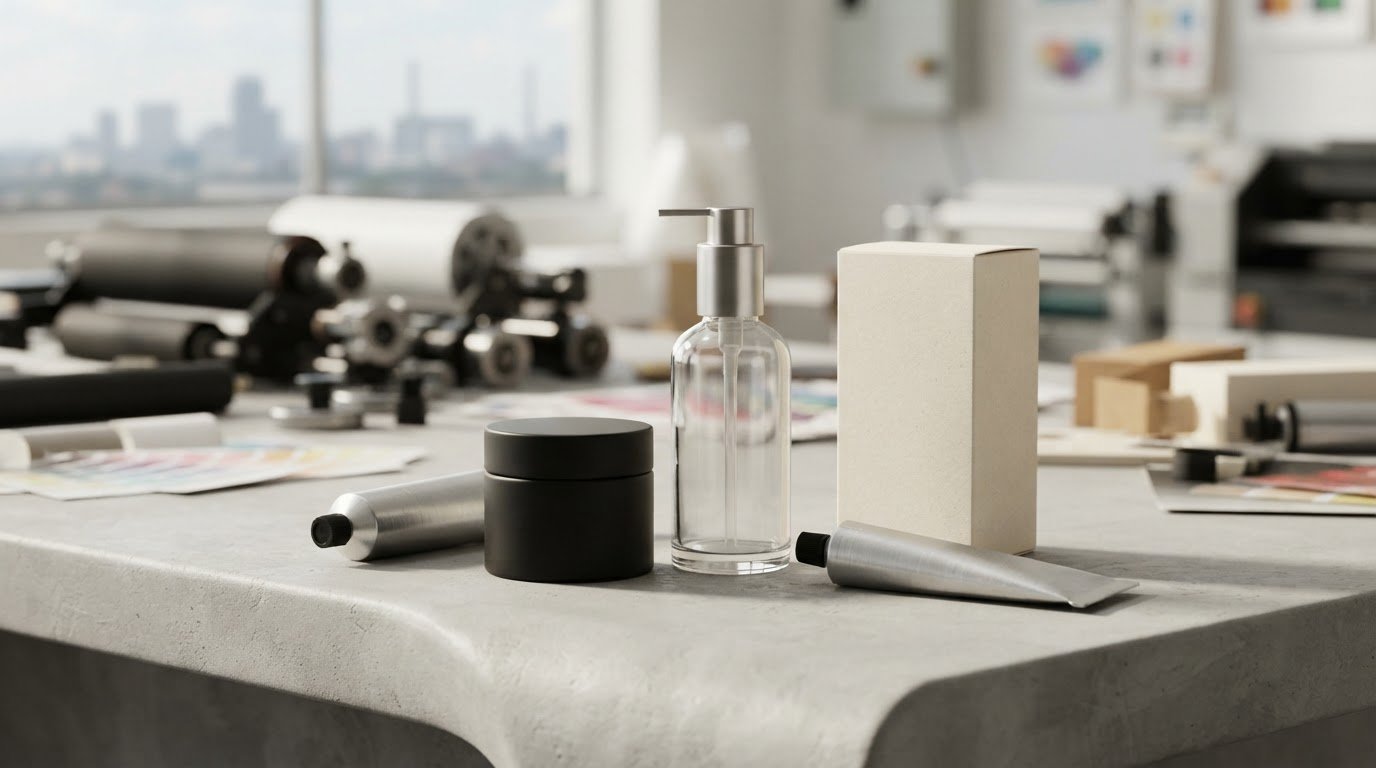
Glass, aluminium, paperboard and recycled plastics are common cosmetic packaging options. Each involves trade-offs in appearance, weight, reuse and recycling. A glass fragrance bottle can convey quality and durability, while a paperboard carton provides a printable outer surface. Choose materials based on the product’s needs, not appearance alone.
Glass suits fragrance packaging, where its weight and solid feel can support a premium presentation. Amber glass bottles can help keep light-sensitive products, such as vitamin C and retinol, stable. The glass colour is therefore part of the functional design, not just a visual choice. Consider the complete pack, including its closure and outer carton.
Aluminium can be used in reusable packaging, and recycled glass is another option for brands seeking recycled materials. Glass and aluminium can be recycled indefinitely without losing quality, but recycling depends on collection and processing through an appropriate system. Material choice alone doesn’t guarantee that a used package will be recycled.
Paperboard and recycled plastics are also identified as eco-friendly cosmetic packaging materials. Paperboard can carry printed product information or provide an outer layer around a container. Recycled plastic can reduce reliance on new material, though its recovery depends on available recycling systems. Consider the intended disposal route as well as the material’s source.
Weight matters beyond the container itself. Reducing material weight can lower packaging-related transport emissions, so compare the complete pack rather than focusing only on its main component. A heavy glass bottle with a substantial outer carton, for example, uses more material than the bottle alone suggests. Removing unnecessary layers can reduce the overall packaging load.
Refill systems offer another way to rethink material use. A refill pack, such as a 300ml pouch, can reduce waste and save money compared with replacing a complete pack. The reusable container and refill must work together as a practical system. Consider how customers dispense, store and replenish the product, rather than treating the refill as a separate design detail.
Use these questions to assess a material choice:
- Product fit: Does the format suit the product, such as amber glass for light-sensitive formulas?
- Material use: Can you reduce weight or remove an unnecessary outer layer?
- End of use: Does the package use recycled material, support reuse or suit available recycling systems?
Review material, weight, graphics and format as one package. For a coordinated printed finish, discuss your cosmetic packaging design and how its printed elements can support the chosen material.
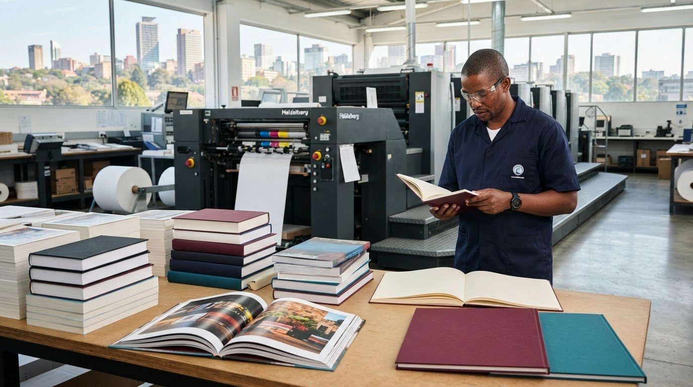
Print It ZA print and packaging: Books
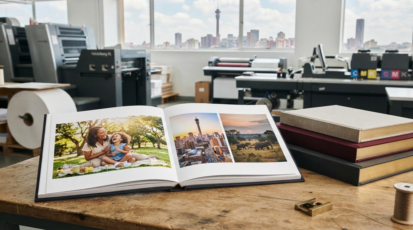
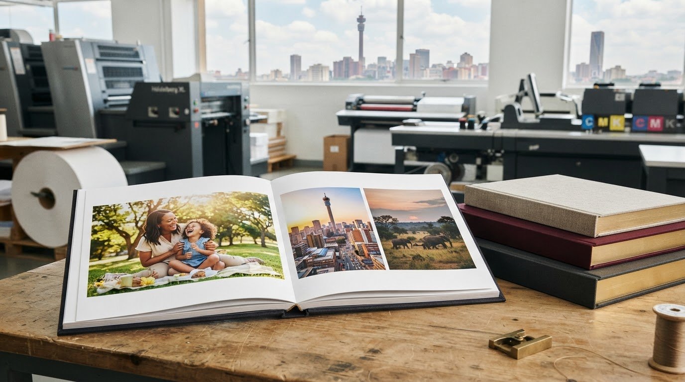
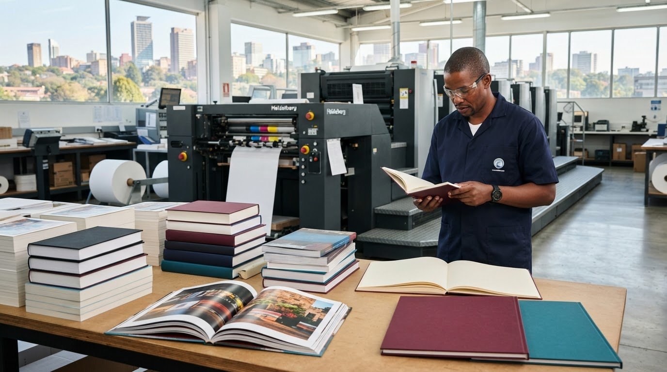
Print It ZA produces retail packaging and can help bring cosmetic packaging artwork into a finished retail format. Its retail packaging suits designs that need to present products clearly on shelves. Brochures and catalogues can also support a product range, giving customers more space to explore details, variants and brand information.
For product guides or broader printed materials alongside packaging, books offer a format for more detailed information. The right combination depends on what customers need to learn and where they encounter it. Clear artwork and a considered format help connect packaging with supporting print materials.
Contact Print It ZA to discuss your packaging and print project, or visit printitza.co.za.
Turn your packaging direction into a finished project
Turn your visual direction into a clear production brief. Bring together your preferred artwork, packaging format, intended customer and the details that must remain easy to read. This gives the design work a practical foundation and keeps each decision connected to the product’s purpose.
Think beyond the container. A consistent identity across packaging and supporting materials can create a joined-up customer experience. Print It ZA produces retail packaging, books, catalogues and brochures, giving brands options for presenting product information across formats.
Share the direction you have in mind and explore how it can translate into print. For help moving your cosmetic product packaging design forward, contact Print It ZA print and packaging. A focused brief is a strong starting point, and your next design decisions can build from there.
Frequently Asked Questions
What are the latest trends in cosmetic product packaging design?
Current directions include minimalist layouts, transparent packs, refill formats and plant-based inks. A skincare range, for example, can keep one core carton layout while adapting product names and accents for cleanser, serum and moisturiser. Use foil-stamping or embossing selectively for details that merit emphasis, as specialty finishes increase cost per package. Choose trends that suit the product and work consistently across the range.