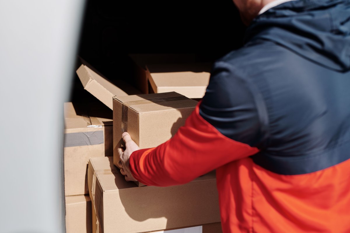
Most training manuals end up in one of two places: on the desk of someone who refers to it regularly, or at the bottom of a bag where it stays until the next office clear-out. The difference between those two outcomes is not the quality of the training itself. It is the quality of the manual.
A training manual that is hard to use — difficult to read, poorly bound, printed on paper that feels flimsy — signals to the participant that the organisation did not take the material seriously. And if the organisation did not take it seriously, why should they? On the other hand, a well-designed, well-printed manual that lies flat on the desk, has clear headings, and holds up to a full day of handling makes the same content feel worth engaging with.
At Print It ZA, we print training manuals for organisations across South Africa — from small businesses running onboarding programmes to large corporates delivering multi-day skills development courses. Here is what we have learned about the difference between a manual that gets used and one that does not.
Start With How the Manual Will Be Used
Before you think about design, binding, or paper stock, think about the context in which this manual will actually be used. That context shapes every production decision that follows.
Will participants write in it? If the manual includes exercises, reflection prompts, or fill-in sections, it needs to be printed on uncoated paper that accepts pen and pencil marks cleanly. Glossy coated paper looks polished, but pen ink sits on the surface rather than absorbing into it — making writing uncomfortable and smudgy.
Will it be used over multiple sessions? A manual for a two-day workshop needs to survive being packed into a bag, opened and closed repeatedly, and possibly carried home. This means the cover needs to be heavier stock — at least 250gsm — and the binding needs to hold up to repeated use.
Will it sit on a desk for reference during training? If facilitators or participants are expected to have it open in front of them while working, it needs to lie flat. This is the strongest argument for wiro or spiral binding — it stays open at any page without needing to be held down.
Is it a take-home reference document? If the manual doubles as a reference guide that participants will return to after the training, it needs to look professional enough to keep on a shelf. In this case, a perfect-bound manual with a clean spine and a branded cover makes a much better impression than a stapled booklet.
Choose the Right Binding for Your Needs
Binding is the single most important production decision for a training manual. It affects how the manual behaves during use, how long it lasts, and how it is perceived.
Wiro Binding
Wiro binding is our most popular choice for training materials, and for good reason. The metal wire coil allows the manual to lie completely flat on any surface — no hands needed to hold it open. Pages turn smoothly and the binding holds up well to heavy use. It also allows participants to fold the manual back on itself, which is useful when working in a limited desk space.
Wiro binding works for manuals from around 20 pages up to about 200 pages. For very thick manuals, the wire can become stiff — at that point, consider splitting the content into two or more volumes.
Spiral Binding
Spiral binding works on the same lie-flat principle as wiro, with a continuous plastic coil rather than a metal wire. It is a slightly more economical option and works well for shorter manuals. The coil is somewhat more visible than wiro binding, which suits a more casual or informal tone.
Perfect Binding
Perfect binding gives a training manual a flat square spine — the same construction as a standard trade paperback book. It looks professional on a shelf, photographs well, and gives you a spine to print a title on. The trade-off is that it does not lie completely flat when open, which can be inconvenient during active use.
Perfect binding is the right choice when the manual is primarily a reference document or when the printed product needs to look highly professional — for client-facing training, executive programmes, or branded courses that participants will keep.
Saddle Stitching
Saddle stitching — stapled through the spine — is the most economical binding option and works well for shorter manuals up to about 64 pages. It is a practical choice for handouts, workbooks for single-session training, or supplementary materials within a larger training programme.
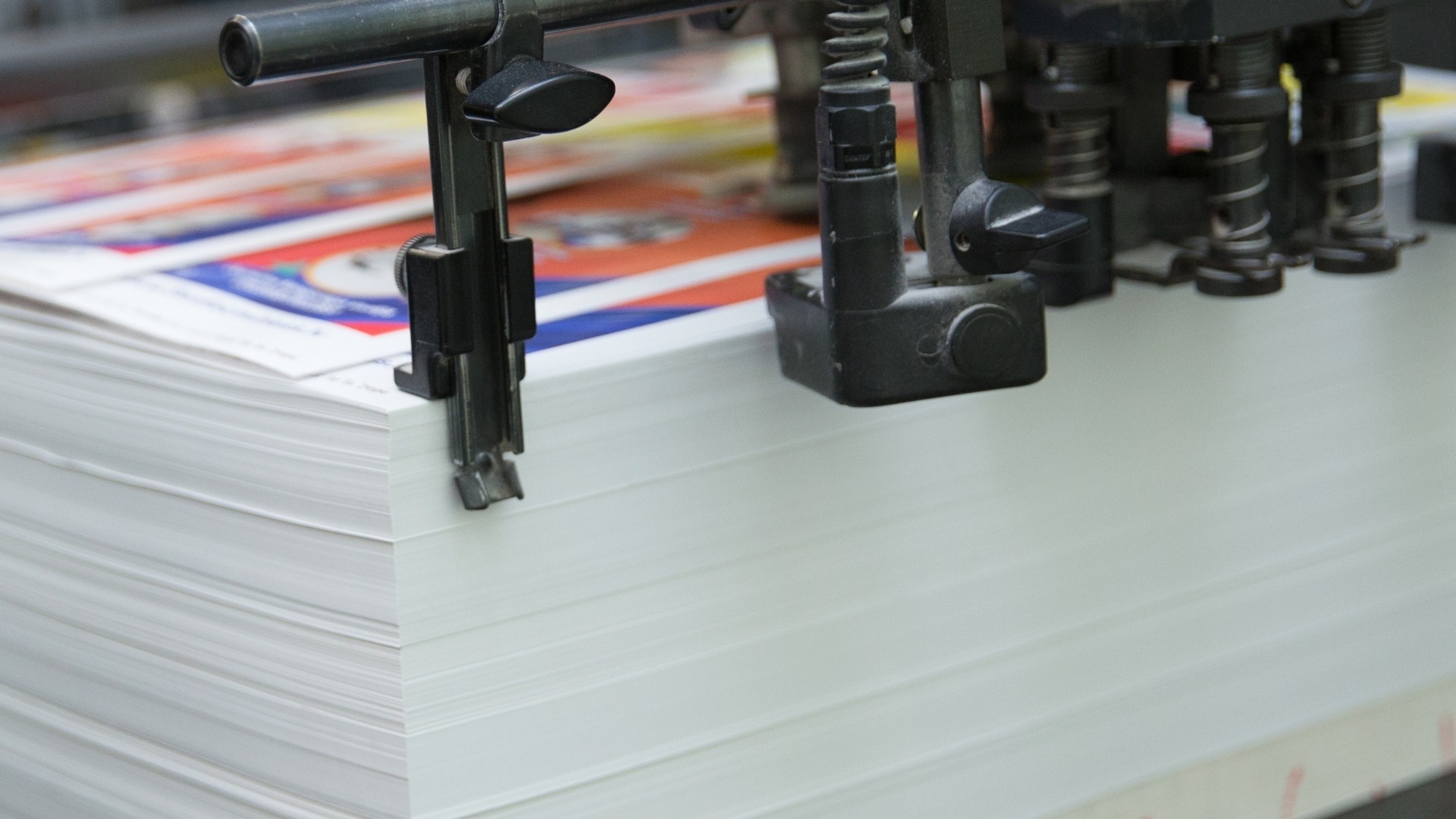
Paper Stock: The Detail That Changes Everything
Paper stock is not glamorous, but it is one of the most noticeable quality indicators in a printed training manual. Here is a simple guide to the key decisions.
Cover Stock
The cover takes more handling than any other part of the manual. A minimum of 250gsm is recommended — 300gsm or 350gsm gives an even more premium feel. Lamination protects the cover from scuffing and moisture. Matt lamination gives a more refined look and is easier to write on if facilitators need to personalise copies. Gloss lamination is more vivid and slightly more durable.
Interior Pages
For manuals with writing sections, 80–90gsm uncoated paper is the standard choice. It accepts all writing instruments cleanly, prints text sharply, and is economical enough to keep per-unit costs reasonable on large print runs.
For manuals that are primarily reference documents — with charts, infographics, photography, or branded design elements — 100–130gsm coated paper gives a noticeably better result. Colours are more vibrant, images are sharper, and the overall feel is more considered.
Design Principles That Make Manuals Actually Usable
Great printing cannot save a badly designed manual. Before a file goes to press, the design needs to work for the reader — not just look good on a screen.
Structure and Navigation
Participants should be able to find any section quickly. This means a clear table of contents, consistent heading hierarchy (main headings, subheadings, section breaks), and page numbers throughout. If the manual covers multiple modules, consider using tabs or colour-coded section dividers to make navigation even faster.
White Space
Cramming content onto every page to reduce page count is a false economy. A dense page is harder to read, harder to navigate, and harder to engage with. Generous margins and spacing between sections make a manual feel approachable rather than overwhelming.
Font Size and Line Spacing
Body text should be at least 10–11pt for comfortable reading. Line spacing of 1.2–1.5 makes paragraphs easier to follow. These numbers sound small but the difference in readability is significant — particularly in a training environment where participants may be tired or working quickly.
Colour and Brand Consistency
If the training is delivered under a company brand, the manual should reflect that brand consistently — same fonts, same colours, same logo placement. This reinforces professional credibility and makes the training feel like a coherent, invested programme rather than a hastily assembled collection of documents.
File Preparation Before You Submit
Once your design is finalised, your file needs to be prepared correctly for print. The most common issues we see with training manual files are low-resolution images, RGB colour mode instead of CMYK, and missing bleed on cover pages.
For a full walkthrough of how to prepare a print-ready file, read our step-by-step guide to print-ready file preparation. In summary: export as PDF/X-1a, ensure all images are 300dpi at print size, set your document to CMYK, and include 3mm bleed on cover pages.
If you are not sure whether your file is ready, send it to us and we will check it before production starts.
How We Handle Training Manual Printing at Print It ZA
We print training manuals in short and long runs, with turnaround times that fit real programme delivery schedules. Our training manual printing service covers the full range of binding options, paper stocks, and cover finishes — and our team is available to advise on the best production specification for your specific brief.
If your organisation also produces supporting materials — booklets, brochures, or printed business cards for facilitators — we can handle everything in a single order, delivered together.
Call us on 010 446 5618, email info@printitza.co.za, or place your order through our online print shop. We deliver nationwide across South Africa, including Johannesburg, Pretoria, Cape Town, and Durban.
Contact Print It ZA today, for a Free Quote and Speedy Service.
Print It ZA print and packaging, we deliver Printing Best!