What comes to mind when you think of the word classic?
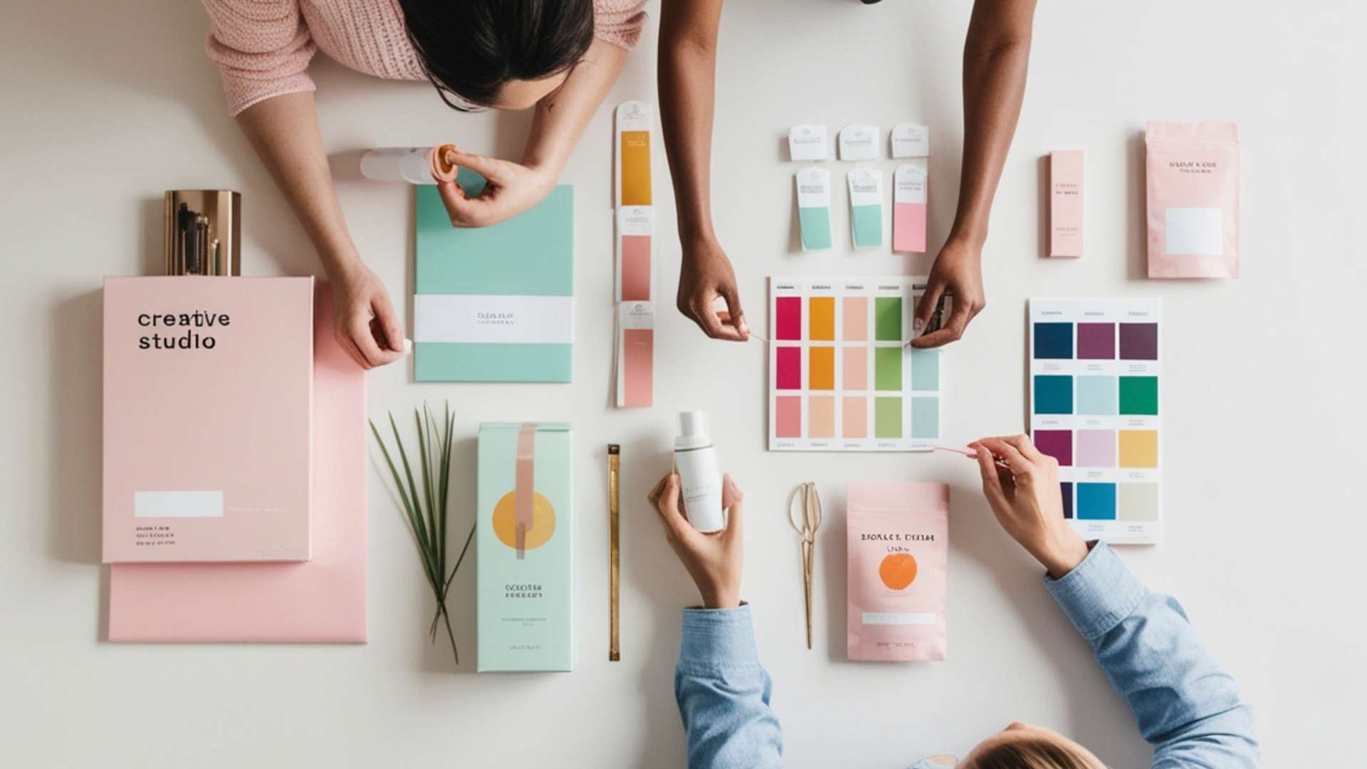
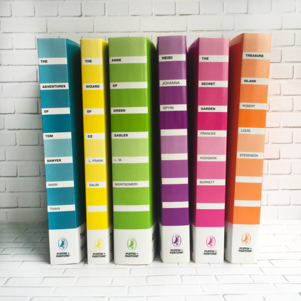
Is it a list of your favorite typefaces? Maybe names like Chip Kidd, Herb Lubalin or Paula Scher? For book publisher Puffin, classic means combining reading with the love of color—Pantone colors. On June 6th, Puffin released a redesign of six classic novels with covers that take on the design of Pantone color cards.
“Overall when you’re designing a classic series, the goal is to create a look that makes classic titles new and collectible, while bringing new generations to older books,” says Danielle Calotta, one of Penguin’s former assistant art directors and mastermind behind the Puffin + Pantone series. “Children, young adults and older book lovers can get an updated look on their favorite books, or select their favorite colors.”
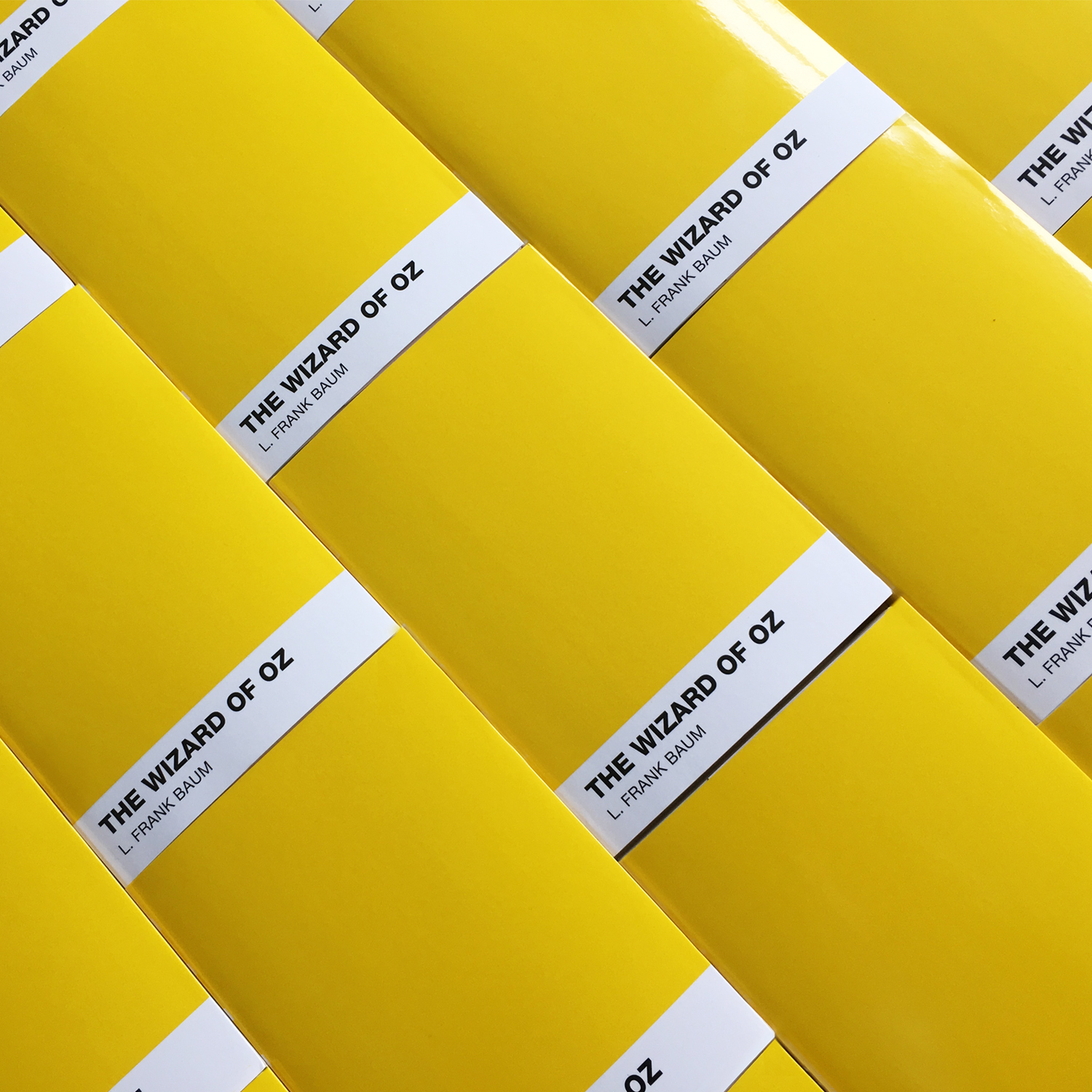
Titles that have taken on the Pantone look include The Adventures of Tom Sawyer (Pantone 632), The Wizard of Oz (Pantone 012), Treasure Island (Pantone 1585), Anne of Green Gables (Pantone 376), Heidi (Pantone 2602), and The Secret Garden (a vibrant pink whose Pantone number I couldn’t find). “Certain classics are more wide-reaching and familiar to readers, which is why we chose some of the most popular titles for the Puffin + Pantone line,” explains Calotta. “They’re the stories adults remember from their childhood and want to pass down to the children in their lives.”
[related: The Resurgence of Yellow Book Covers; 15 Award-Winning Book Covers]
The idea began with Anne of Green Gables, which, naturally, took “a lovely green” as its cover. From there, designers tried to choose colors that “felt right to the heart of the books.” Some titles were easier than others (Wizard of Oz is yellow as a callback to the yellow brick road). The color of the Mississippi River inspired Tom Sawyer’s blue cover, the primrose mountain flowers of the Swiss Alps inspired Heidi’s purple cover and the “swashbuckling blunders unfolding on the beach during a dramatic sunset” inspired the orange cover for Treasure Island.

“Color is visceral to me. Color can be a memory. Color creates mood, changes mood, alters mood. In short, it’s hard to put into words how color inspires me, so this project might have to say it for me,” explains Calotta. “We do initially judge books by their covers. Color can be that hook for a buyer—that reason for the pickup. Whether buyers know it or not, there are definitely color associations for different genres. There are trends that help lead a buyer to a book they might like next,”


SOURCE: http://www.printmag.com/color/puffin-pantone-remake-classics/?utm_source=newsletter&utm_medium=referral&utm_campaign=pr-cbu-nl-170628&utm_source=newsletter&utm_campaign=pr-nl-cbu-170628&utm_content=954003_EDT_PRN170628+%E2%80%93+A&utm_medium=email
#puffin #pantonebook #printmag #colourbook #colourmatch #colourbible #printing #print #printer