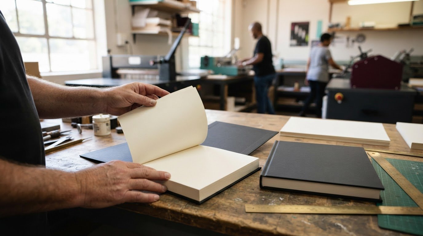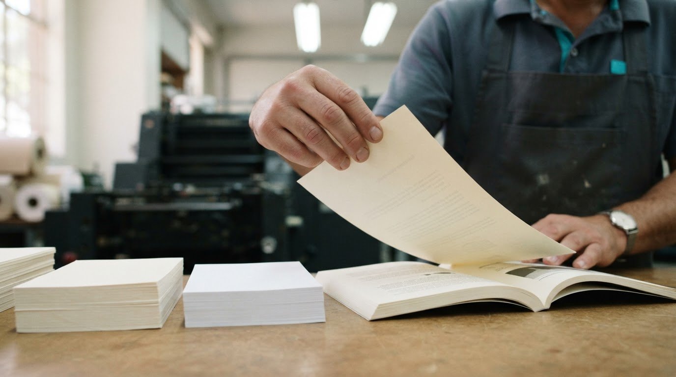
The thickest paper rarely makes the best novel. If you’re deciding what paper is best for printing a novel, uncoated paper around 80-100 gsm is a practical starting point; cream or white stock can suit text-led pages, with cream often chosen for fiction. The right choice balances readability, page thickness and imagery.
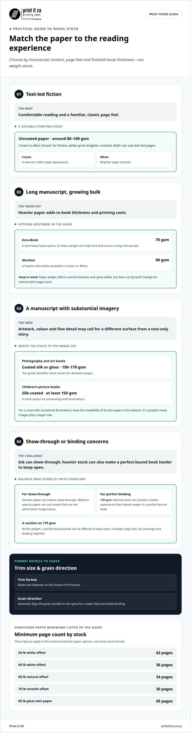
Weight matters, but it is only part of the decision. Colour, surface and opacity also shape the reading experience. Cream can soften a page’s appearance, while white creates brighter contrast. A smooth, uncoated finish gives a novel a familiar feel, and paper thickness affects the book’s bulk and spine.
This guide explains how to decide what paper is best for printing a novel, including how weight, colour and surface suit different manuscripts. You’ll find practical criteria to consider for your book, whether it is a text-only story or includes illustrations.
Key Takeaways
- Match the paper’s surface and opacity to your book’s content: text-led novels usually call for a different stock from image-heavy books.
- Choose weight with the finished book in mind, since heavier paper affects page feel, overall thickness and spine width.
- Consider cream for a warmer reading experience and white when you want a brighter page contrast.
- Learn how offset paper options can help balance readability, colour and the character of your novel.
- Use your manuscript’s visuals and intended reading experience to narrow down suitable paper parameters.
How do you choose the correct paper parameters?
Match paper to the book’s content, intended reader and finished format. Novel size depends on the chosen trim format, while grain direction is generally aligned parallel to the spine for a clean fold and stable binding.
Matching Paper to Content and Audience
Paper choice links a book’s content and audience to its reading experience. A text-heavy novel calls for a different surface from an illustrated children’s book, because ink coverage, detail and page feel all affect the result.
For fiction, smooth uncoated paper supports comfortable reading and a classic appearance. For image-rich books, coated paper can reproduce colourful artwork and fine detail. Audience matters too: a children’s picture book needs pages that present illustrations clearly, while a long novel benefits from paper suited to extended reading.
- Novels and memoirs: 50 lb offset paper or Ecco-Book 70 gsm are text-focused options.
- Photography and art books: coated silk or gloss paper at 150 to 170 gsm suits detailed images.
- Children’s picture books: silk-coated paper of at least 150 gsm supports bold illustration.
- Workbooks and manuals: uncoated paper at 100 to 120 gsm suits writing and reference use.
These examples show why genre should guide book printing choices, rather than paper being selected by appearance alone. A novel with occasional illustrations still needs readable text pages; in a graphic novel, images play a larger role, so the paper should reflect that balance.
Ecco-Book Paper for Text-Heavy Books
Ecco-Book is a volume paper option used for text-heavy books, with 70 gsm cited as a suitable weight for novels. Its lower weight can help limit bulk across a long manuscript, making the finished book easier to handle than one printed on substantially heavier pages.
For a novel, memoir, essay collection or other text-led manuscript, consider how page count and desired thickness work together. Ecco-Book 70 gsm is one option; Munken 90 gsm provides a heavier alternative in Cream or White. Both examples help frame the choice around the reader’s experience and the book’s intended appearance.
Book type also changes the balance. A poetry collection may benefit from a more substantial page feel, while a mass-market paperback often uses lighter stock to stay flexible. A technical manual with detailed diagrams needs paper that presents visuals clearly, unlike a story made up almost entirely of text.
For novels, 80 to 100 gsm uncoated paper is another common range to consider. The best match depends on how the paper feels, how the pages sit together, and whether the manuscript contains images. Discussing trim size, grain direction and stock together helps align the physical format with the content.
Paper weight and thickness for novels
Heavier paper increases printing costs and book thickness. It does not, by itself, change the manuscript’s page count, though hardcover specifications can set minimums for particular stocks.
Weight, Thickness, and GSM
GSM means grams per square metre, a measure of paper weight that helps compare stocks. Paper weight and actual thickness are related, but they aren’t interchangeable: a paper’s bulk also affects how thick it feels. For novel pages, the common range is 70-150 gsm, so choose by both weight and the finished book’s handling.
A 130 gsm internal stock can provide a better experience than heavier paper in a perfect-bound book. By contrast, paper at 170 gsm can make a perfect-bound book difficult to keep open. These examples show why selecting the highest gsm isn’t automatically the best route for readability or binding.
Thickness and Show-Through
Paper thickness affects how much printing on one side shows through to the other. Heavier paper can reduce show-through, which matters when a novel has dense text or images printed on both sides.
For a text-led manuscript, balance show-through against the bulk added to every page. If pages carry dark artwork or heavy ink coverage, consider the paper choice more carefully than for a lightly printed story. Coated paper can suit image-heavy work, but a novel’s surface and page feel should still support comfortable reading.
Medium-opacity paper can suit novels and textbooks that are not particularly image-heavy. Consider the contrast between the printed text and what shows through from the reverse side, especially across spreads with full-page images. A printed sample can help you assess this before deciding on a full print run.
Weight and Overall Book Thickness
Paper weight affects the thickness of the finished book and the width of its spine. Adding weight across many pages increases overall bulk, so a long novel printed on heavier stock may need a wider spine than the same page count on lighter paper.
That difference affects practical decisions, including how the book sits in a reader’s hands and how its cover is prepared. For perfect binding, paper at 170 gsm can make the book harder to keep open. A 130 gsm internal stock may offer a more manageable balance for this format.
Hardcover page-count minimums also vary by stock. The listed minimum is 42 pages for 50 lb white offset, 36 pages for 60 lb white offset, 34 pages for 60 lb natural offset, and 30 pages for 70 lb smooth offset. For 80 lb gloss text paper, the listed minimum is 45 pages.
These figures apply to the stated hardcover paper options, not every novel format. For a paperback, page count, paper weight and binding should be considered together. If you’re planning novel printing, align the stock choice with the manuscript’s length, image coverage and intended format.
Is Cream or White Paper Better for Books?
Uncoated paper gives novels a classic page feel, while coated paper suits colourful images and fine detail. For fiction, cream or white uncoated stock is common, and cream is often chosen to reduce glare.
A standard fiction novel commonly uses uncoated paper weighing 90 to 100 gsm. Within that range, cream and white both work for text-led pages. The choice depends on the intended appearance: cream gives pages a warmer tone, while white creates a cleaner, brighter look for the printed text.
Cream paper has a softer tone that can reduce glare and give a novel a traditional appearance, which may suit literary fiction, memoirs and poetry. White paper, by contrast, can make black text stand out clearly and may suit a crisp, contemporary design.
Colour matters most when the page is mainly text. Readers see repeated spreads throughout a book, so consistent colour helps create a unified impression from the opening chapter to the final page. Using the same stock throughout a short-story collection keeps its visual tone cohesive.
Uncoated paper is a suitable choice for novels, poetry books, workbooks and journals. Its natural surface supports a familiar reading experience without the slick finish of coated stock. For text-heavy fiction, that tactile difference can be as noticeable as the choice between cream and white.
Coated paper serves a different purpose. Silk or gloss coatings can reproduce colourful imagery and sharp detail, which makes them useful for illustrated pages. A children’s picture book, for example, may use silk-coated paper of at least 150 gsm, while a text-led novel generally benefits more from uncoated paper.
Consider how often images appear before choosing a surface. A novel with a few black-and-white illustrations may still suit uncoated pages, while a book built around photographs needs paper that presents image detail well. Cream or white describes the paper colour; coated or uncoated describes its surface. These are separate decisions.
For a practical comparison, review the same passage on cream and white uncoated paper. Check text contrast, chapter openings and whether the page appearance suits the story. A warm-toned historical novel may suit cream, while a clean, graphic layout may favour white.
Children’s books with colourful illustrations show why one stock does not suit every genre. For fiction, choose cream or white to suit the intended reading atmosphere; for image-led books, prioritise how the paper presents the artwork. Matching colour and surface to the content keeps the design purposeful.
Cream and white paper colour choices
Cream and white stock create different visual starting points for a book’s interior. Cream has a warmer tone, while white gives the page a brighter appearance. For a text-led novel, compare the same chapter layout on each colour, including body text, headings and page numbers.
Colour changes the contrast between ink and paper. Black text on white often appears crisp and pronounced; on cream, it can feel softer. That distinction shapes the reading experience across repeated pages, especially in a novel with long chapters and minimal artwork. Review a representative spread, not only a title page.
Choose cream when a warmer page tone supports the book’s intended mood. A historical novel or reflective memoir may suit its natural appearance. Cream is often used for fiction to reduce glare, making it a strong option for extended reading. The shade should still keep body text clear and easy to follow.
White may suit a contemporary design with strong black typography, fine line work or bright graphic elements. It creates a clean base for high contrast between text and page. For a novel with chapter ornaments, maps or diagrams, inspect those details on white stock to see whether thin lines and small labels remain distinct.
Colour also influences image reproduction. Cream can warm the appearance of printed images, while white offers a more neutral background. If a novel includes colour plates, compare the artwork on both stocks. Check skin tones, pale backgrounds and subtle shades, which may look different against cream than against white.
Keep the interior consistent. Using one paper colour throughout gives the book a unified appearance, while switching between cream and white can make sections feel visually separate. That contrast may suit a deliberate design, such as a story alternating between narrative chapters and a documentary insert, but an unplanned change can interrupt reading.
Paper colour and finish are separate choices. A smooth uncoated sheet can provide a natural page feel in either cream or white. Coated paper can support sharper image detail, but may not suit the desired reading feel of a text-led novel. Decide on colour and surface together, rather than treating them as interchangeable.
Use a printed sample to make the final comparison. Place the same passage, heading and image on cream and white sheets, then assess contrast and reproduction under the lighting where readers are likely to use the book. Include a thicker cover sample beside the pages if you’re judging the complete appearance, since cover colour can change the impression of the interior.
A practical choice matches the page to the book’s design: cream for a warmer fiction interior, white for brighter contrast or image clarity. For a mixed-content novel, assess the text and each image type before settling on one colour. This comparison helps the paper support the story rather than compete with it.
Offset paper types and weights
Paperback novels commonly use cream-coloured 50 lb or 60 lb offset paper. Common print-on-demand choices also include white 50 lb and 60 lb offset, smooth white 70 lb offset, and 80 lb gloss text paper.
Offset paper is a practical category to compare by colour, weight and surface. For a text-led paperback, 60 lb cream offset offers a familiar fiction format; 50 lb white offset is another option when a lighter page feel suits the design. The right balance depends on how the stock affects readability, book thickness and the intended appearance.
These offset choices serve different purposes:
- 50 lb white offset: A lighter option for text-focused interiors.
- 60 lb white offset: A versatile choice when a brighter page is preferred.
- 60 lb cream offset: A popular fiction option with a warmer page tone.
- 70 lb smooth white offset: A heavier, smooth option for a more substantial page feel.
- 80 lb gloss text: A glossy choice better suited to image-led pages than a standard text-only interior.
The difference between white and cream offset paper is not only visual. Cream can soften the page’s appearance, while white creates brighter contrast with black text. Choose based on the novel’s design and intended reading experience, then keep the stock consistent throughout the interior.
Weight also affects the finished paperback. Heavier paper adds thickness across the page block, which can change the spine width and how the book sits in the reader’s hands. A long manuscript on 70 lb stock will build more bulk than the same page count on 50 lb stock. That trade-off matters when balancing a substantial feel with a manageable format.
Offset and glossy text stocks have different surfaces. Smooth offset paper keeps attention on the text, while gloss can enhance colour and image reproduction. If your paperback contains occasional illustrations, consider whether they need the shine and detail of a glossy finish or whether offset paper better supports the overall reading experience.
For a text-heavy novel, start by comparing 50 lb and 60 lb offset in the colour that fits your design. Then consider whether a thicker 70 lb sheet brings useful substance or unnecessary bulk. An 80 lb gloss stock is a distinct option for interiors where images need more emphasis, rather than a default choice for fiction.
Reviewing paperback printing options alongside your manuscript’s page count can help align stock weight with the format. Explore paperback printing when you’re ready to shape those choices into a finished book.
Print It ZA print and packaging
Print It ZA produces books using litho and digital printing. If you are weighing cream against white, or lighter stock against a thicker page feel, its book printing service can connect those choices with your manuscript and intended format.
Share the book’s content, page count and design priorities, including whether it contains images. These details help frame paper weight, colour and surface as parts of one production decision, rather than isolated specifications. Print It ZA also produces catalogues, brochures and retail packaging.
When you’re ready to discuss your book project, contact Print It ZA print and packaging.
Shape the final feel of your novel
Paper is part of your book’s design, not just a production detail. It influences how the finished pages feel in a reader’s hands and how the story’s visual identity comes together. Before finalising your manuscript, note the qualities you want the physical book to convey, such as a traditional feel or a crisp, contemporary appearance.
Deciding what paper is best for printing a novel becomes easier when you connect that intention with your layout and binding format. A clear brief helps align design and production decisions, especially if your manuscript includes images or distinctive chapter layouts. Think about the reading experience you want from the first page to the last.
When you’re ready to move from paper choices to a production plan, contact Print It ZA print and packaging to discuss your project.
Your story is ready to take its next step towards becoming a book readers can hold and enjoy.
Frequently Asked Questions
What Is Book Printing Paper?
Book printing paper is the stock used for a book’s interior pages or cover. Interior paper carries text and images, while cover stock supports the outer design and structure. A text-only paperback and an illustrated cookbook, for example, have different page requirements. The paper’s shade, surface and weight all influence how the finished book looks and feels.
What about eco-friendly paper or specialty paper?
Eco-friendly and specialty papers offer alternatives to standard book stocks, but their qualities vary. Some have distinctive textures or natural colours that change the printed appearance. Before selecting one, consider how its surface will reproduce your text and images and how it fits your book’s design. A printed proof helps you assess these details together rather than relying on a paper description alone.
What paper weight and thickness is best for printing a novel?
Uncoated paper around 80 to 100 gsm is a useful range for a novel’s interior. For a lighter, more flexible paperback, lower-weight options can suit a long manuscript; a heavier sheet creates a more substantial page block. Judge the stock alongside your planned binding and page count. A paper sample lets you compare feel and bulk before settling on the finished format.
Is cream or white paper better for novel pages?
Cream suits fiction when you want a warm page tone, while white creates brighter contrast with dark text. To compare them, print a representative page containing body text, a heading and any recurring design elements. Look at both samples under the lighting where you expect the book to be read. This helps you choose a colour that supports the novel’s visual style.
What paper opacity prevents text showing through in a novel?
There is no single opacity figure that suits every novel. Medium-opacity paper can work for text-led books without extensive images. For a practical assessment, print a page with the darkest text or image coverage and inspect its reverse side. This shows whether show-through distracts from the next page. Consider ink coverage and paper stock together.
What paper specifications do South African book printers recommend?
Common options for novel interiors include uncoated paper at 80 gsm, Ecco-Book volume paper at 70 gsm, and Munken book paper at 90 gsm. Offset stocks are another route, including cream or white choices. These specifications give South African authors a starting point for discussing a book’s format, page design and binding, rather than a universal formula for every manuscript.
What paper is best for reading comfort and durability in a printed novel?
For reading comfort, choose a paper shade and surface that keep the text clear across a full spread. Cream is a popular choice for fiction, while uncoated stock gives pages a natural feel. Durability matters too: a thicker sheet can make pages feel more substantial, but adds bulk. Consider how the novel will be handled and stored alongside the intended reading experience.
What paper size and grain direction are used for novel printing?
Novel size depends on the chosen trim format, and grain direction is generally aligned parallel to the spine.