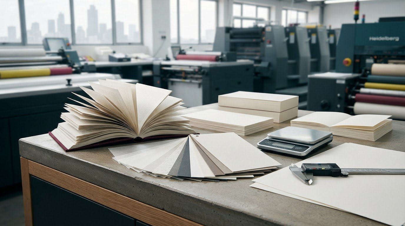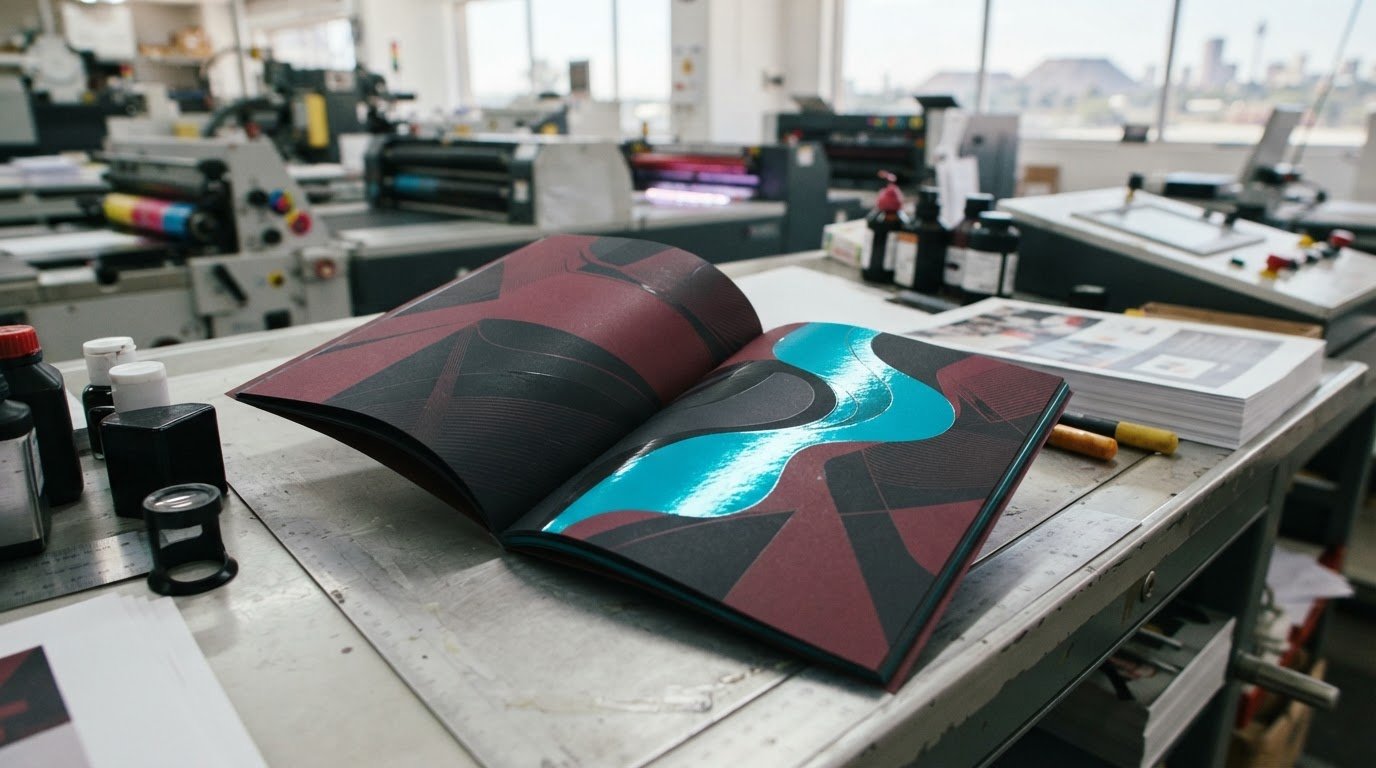
What if the heavier paper you’re considering makes your book harder to read rather than more premium? Choosing the right paper weight for your book can feel like a technical puzzle when GSM figures sit beside unfamiliar finishes and stock descriptions. It’s natural to focus on the number, but paper should first suit the reading experience: how the book feels in hand, how easily pages turn, and how text or images appear. GSM means grams per square metre, a measure of paper mass per area, not a complete guide to thickness, opacity, texture or print result.
This guide explains what GSM tells you, how to compare paper for novels, children’s books, manuals and image-led titles, and how finish and weight work together. You’ll also see how paper affects a book’s thickness, handling and print planning, and what to prepare before discussing your project. Start with your content, format and readers’ needs, then compare paper options against those priorities. This gives you a practical basis for making decisions with your printer and shaping a finished book that feels right from the first page to the last.
Key Takeaways
- GSM measures paper weight per square metre, but it doesn’t tell you everything about thickness, opacity, stiffness or finish.
- When choosing the right paper weight for your book, match paper qualities to the content, design and way readers will use it.
- Compare paper options for text-heavy novels, picture books, illustrated titles and manuals based on readability, image presentation and handling.
- Use samples and proofs to assess how paper feels and prints before finalising your specifications.
- Heavier paper isn’t automatically better; the right choice balances the reader experience with the book’s practical requirements.
Choosing the Right Paper Weight for Your Book Starts with the Reading Experience
A paper number can look reassuringly precise, but it can’t tell you on its own whether a book will feel comfortable, look right or suit its content. Weight is only one part of the experience. Readability also depends on how the paper handles text and images, whether print from the reverse side distracts the reader, and how the finished pages feel in the hand.
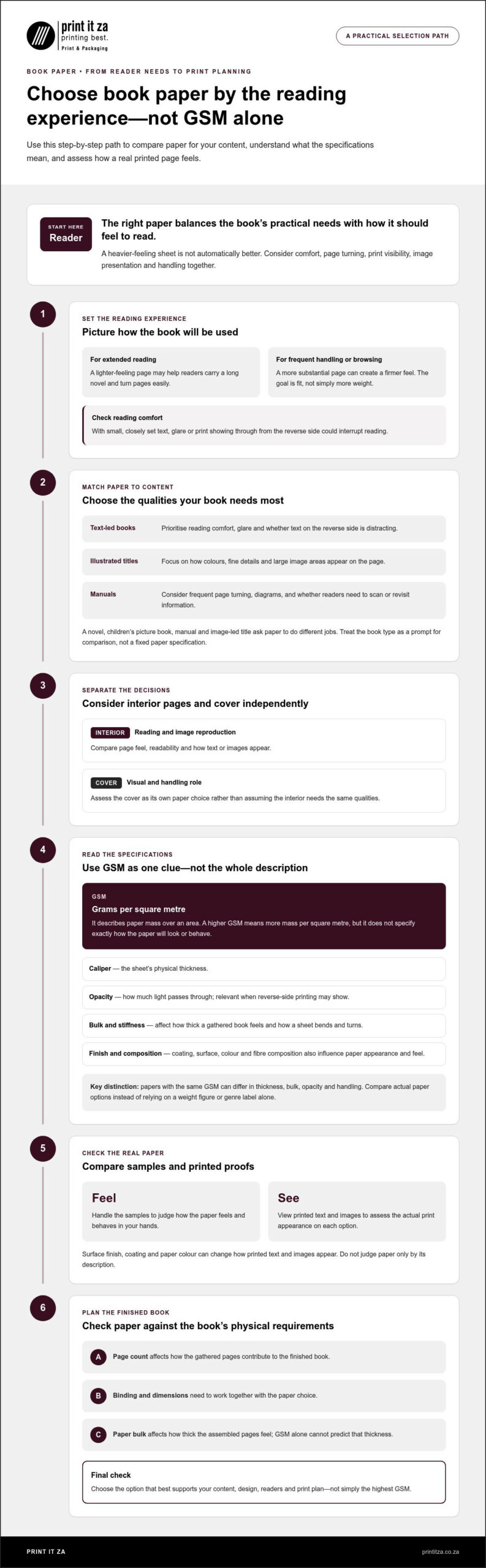
Book paper should match the content, design and intended reading experience. Consider the interior and cover as separate decisions. Interior pages need to support reading and image reproduction, while the cover has its own visual and handling role. The Book paper overview offers useful background on the characteristics publishers consider.
What should book paper feel like to the reader?
Think about how someone will use the book. A lighter-feeling page may help readers carry a long novel and turn pages easily during an extended read. A more substantial page can create a firmer feel, which may suit a book that readers handle often or browse slowly. Neither is automatically better. The goal is to make the physical experience fit the book.
Imagine reading small, closely set text under bright light. Glare or print showing through from the other side could interrupt the experience, even if the paper weight seems suitable. In a picture-led book, colour and image detail may matter more than quick page turning. Use these considerations to guide your paper comparison.
Weight alone doesn’t determine feel. Surface finish, coating and paper composition also affect how a sheet looks and behaves. Compare samples in your hands and view printed text or images on them, rather than judging a paper only by its description.
Why the same paper choice does not suit every book
Different books ask paper to do different jobs. A novel is mainly about comfortable, uninterrupted reading. A children’s picture book needs to present illustrations well and suit frequent handling. A manual may be consulted in short bursts, while an image-led title needs to show photographs or artwork clearly. Treat these as prompts for your project, not fixed paper specifications.
Start by considering the balance of words, images and colour:
- Text-led books: Consider reading comfort, glare and whether text on the reverse side is distracting.
- Illustrated and image-led books: Focus on how colours, fine details and large image areas appear on the page.
- Manuals: Think about frequent page turning, diagrams and whether readers need to scan or revisit information.
Then consider the book’s format and purpose. A portable paperback, a keepsake photo book and a classroom resource may need different combinations of page feel, image presentation and durability. Even books with similar content can call for different choices if their layouts, colour coverage or intended readers differ. That’s why choosing the right paper weight for your book starts with the reader, not a number on a stock list.
GSM Explained: What Book Paper Weight Tells You, and What It Does Not
GSM means grams per square metre. It describes paper grammage: the mass of a sheet measured over a defined area. A higher GSM means more mass per square metre, but it doesn’t tell you exactly how thick, opaque or stiff the paper will be. Treat GSM as one useful specification, not a complete description of how a page will look or behave in a finished book.
GSM measures paper mass per area; caliper measures the sheet’s thickness. These terms describe different properties, so a GSM figure alone can’t tell you how much space a stack of pages will take up. That distinction matters during print planning, especially when the page count, binding and finished book dimensions need to work together.
GSM versus thickness, opacity, and paper feel
Thickness, often called caliper, is the physical distance between a sheet’s surfaces. Opacity describes how much light passes through the paper. In practical reading terms, it indicates how visible printing on the reverse side is from the front. If reverse-side text distracts from a page, opacity may be as relevant to your decision as grammage.
Paper bulk also affects how thick a book feels when its pages are gathered together. Stiffness influences how a sheet bends and turns. Neither is determined directly by GSM alone. Two papers with the same grammage can differ in thickness, bulk, opacity and handling, so they may produce different results in the same layout.
Surface coating, colour, fibre composition and manufacturing all influence how paper looks and feels. A smooth, coated surface can present images differently from an uncoated surface, while paper colour can change the appearance of printed text and images. For a broader explanation of paper-weight terminology, Paper Weight Guide: GSM, Pounds, and Choosing Stock also compares GSM with other ways of describing paper.
How to read paper-weight examples responsibly
A GSM figure attached to a book type is a starting point for discussion, not a universal rule. Novels vary in format and layout, while illustrated books differ in image coverage and colour needs. Without examining the particular paper and print requirements, a weight range can give a misleading sense of certainty. When choosing the right paper weight for your book, compare actual options for the intended job rather than relying on a genre label.
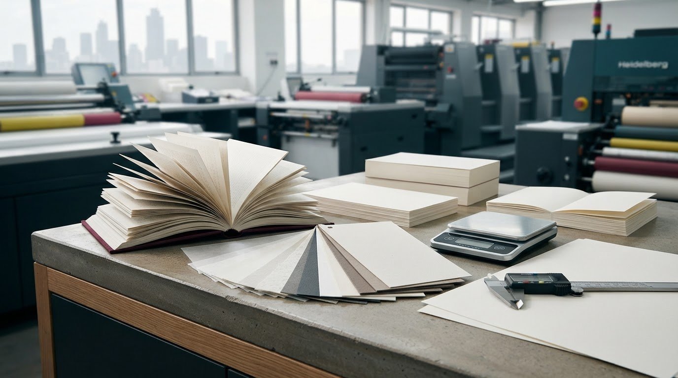
Make the comparison practical. Place samples beside each other under lighting similar to where the book will be read. Look at text printed on both sides, check how images reproduce, and handle the sheets as a reader would. This helps you assess properties that a specification can’t communicate on its own.
Bring your page count, format, design priorities and intended use into a discussion about book printing specifications. Print It ZA can help you consider how paper choices fit the overall production brief, rather than treating one number as the whole answer.
Compare Book Paper Weights by Genre, Images, and Intended Use
There isn’t one paper choice that works for every book in a category. A novel with a compact layout, for example, may have different priorities from a large-format novel with illustrations. Use the comparison below to identify what to investigate for your project. It offers decision prompts, not fixed weight recommendations or specifications for a particular print job.
| Content type | Reader priorities | Paper characteristics to investigate |
|---|---|---|
| Text-led novels | Comfortable reading, easy page turning and manageable overall bulk | Opacity, surface feel and how clearly text prints on both sides |
| Children’s picture books | Clear illustrations, enjoyable browsing and a page feel suited to handling | Colour reproduction, opacity, stiffness and how sheets turn |
| Illustrated or photographic titles | Faithful presentation of images and colour across the layout | Image detail, colour coverage, surface and reverse-side show-through |
| Manuals and educational books | Legible text and diagrams, with pages that stand up to frequent reference | Readability, opacity and practical handling through repeated use |
Text-led books and practical reference titles
For a text-heavy novel, consider how the pages will feel over a long reading session and whether the finished book will remain comfortable to carry. A paper choice that adds bulk may affect the overall thickness, so weigh page feel against portability. Also check opacity. Text showing through from the reverse can compete with the words being read, particularly on closely set pages.
Manuals and educational books are often consulted, put down and opened again. Check whether body text, headings and diagrams remain easy to distinguish, and whether the pages are practical to turn during use. A textbook with charts and colour has different demands from one made up mostly of text. Choosing the right paper weight for your book means considering its specific layout and use, not assigning one weight to every novel, manual or textbook.
Illustrated, photographic, and children’s books
Image-led books put more emphasis on how colour and detail reproduce across the page. Large areas of colour or dark images may make reverse-side show-through more noticeable, so assess the printed result on both sides of a sample. For children’s books, also consider how the page feels during frequent handling. A more substantial feel may support the intended impression, but balance it with the book’s format and ease of use.
Paper doesn’t determine the finished book in isolation. Binding, page count and trim size all interact with the stock, affecting bulk, spine dimensions and how the book opens and handles. A paper that suits a short illustrated title may produce a very different result in a longer book. Compare options against the complete design and production brief, then review a printed proof or sample before finalising the specification.
A Practical Paper-Selection Process: Samples, Proofs, and Print Planning
A confident decision comes from matching paper to your book, then checking how that choice works in print. Heavier paper isn’t automatically better. It may add a more substantial feel, but it can also change the book’s bulk and handling. Choosing the right paper weight for your book means balancing the reader experience with the design and practical needs of the finished project.
Prepare a clear paper brief before comparing options
Start with a short brief that captures what the book needs to do. It gives you and your print partner a useful basis for comparing options, rather than choosing a GSM number without context. Include details such as:
- Content and readers: Note the genre, intended audience and whether the book is mainly text, images or a mix.
- Design: Describe image coverage, colour use and any areas where reverse-side show-through could affect legibility.
- Format: Record the page count, trim size and preferred binding.
- Handling: Say whether portability, frequent reference or a particular page feel matters most.
Be specific about the experience you want, such as easy page turning for extended reading or a firm feel for a book that will be handled often. These priorities help narrow the comparison. They also give the production team context to consider paper alongside the layout and binding, rather than treating the stock as a standalone choice.
Assess samples and proofs in context
A loose, unprinted sheet can show texture and colour, but it can’t demonstrate how your actual text and images will reproduce. Review printed samples or a proof using pages from your own design or representative content. Look at them in ordinary reading conditions, not only under bright production-room lighting.
Compare each option consistently. Check whether small text stays clear, whether colour and image detail look right, and whether printing on the reverse side is distracting. Turn the pages, hold the sample as you expect readers to hold the finished book, and consider whether its feel suits the format. Assess the sample as a reader would, not just as a sheet specification.
Before approving production specifications, review the paper choice alongside the page count, trim size and binding preference. A stock that feels suitable in a single sheet may contribute to a finished book that is bulkier or handles differently than you intended. If the proof raises a concern, revise the specification and assess the result again.
Print It ZA’s in-house design team supports book projects from creative development through production. Plan your book print project with Print It ZA and bring your brief into the conversation.
Work with Print It ZA to Perfect Your Book Paper Choice
The best paper decision supports your readers, content and design while working for the finished book’s practical needs. GSM can help describe a paper, but it shouldn’t be the only detail guiding your choice. Consider how the pages should feel, how text and images need to reproduce, how often readers will handle the book, and how the format and binding shape the final result.
Print It ZA produces books using lithographic and digital printing. These capabilities support different kinds of book projects, while the in-house design team can help connect creative decisions with production planning. Paper selection is part of that wider conversation, not a decision made in isolation.
Bring your book concept and production priorities
Start with the material that explains your project best. A manuscript or page plan can show how much text, imagery and colour the book contains. Add the intended audience, format, approximate page count and binding preference so the production brief reflects the book as a whole.
Describe the experience you want readers to have. Is the book meant to be easy to carry and comfortable for long reading sessions? Will readers revisit it often, or is it an image-led title designed to be browsed and displayed? Words such as “light in the hand”, “easy to turn” or “substantial” can help communicate your priorities without locking the discussion to a GSM figure too soon.
These details give the team a clearer basis for considering paper in relation to the layout and production requirements. The final choice should make sense for the complete brief, including the relationship between interior pages, cover, binding and intended use.
Align paper choice with printing and delivery goals
Print method and page design inform paper planning. Text-heavy layouts, full-colour illustrations and large image areas place different demands on the printed page, so consider the artwork alongside the planned production approach. Print It ZA’s lithographic and digital printing capabilities support book projects through production, with specifications considered in context rather than tied to a generic recommendation.
As the project develops, keep the approved paper choice, layout and binding aligned. A change to page count or design can affect the finished book, so revisit the full specification if the brief changes. Print It ZA’s in-house design team supports projects from creative development through production and delivery, helping carry the vision into a coordinated print plan.
Print It ZA serves authors and publishers in Gauteng and delivers nationwide in South Africa. Share your concept, audience and production priorities to start shaping a specification that suits your book.
Set Your Book Up for a Confident Print Decision
Before moving into production, decide what matters most to your readers and where you’re comfortable being flexible. Perhaps the pages must stay easy to handle, or the artwork needs to make a strong impression. Having that priority clear keeps paper decisions focused on the book’s purpose rather than on a specification in isolation.
Choosing the right paper weight for your book is part of shaping how the finished work meets its audience. Use your production discussion to connect the creative vision with practical choices, and make sure the agreed direction supports the complete project. A thoughtful brief gives everyone a shared reference point as the book moves from concept towards print.
Print It ZA supports book projects through production planning, lithographic and digital printing, in-house design support and nationwide delivery in South Africa. Bring your priorities and creative direction to the conversation, then take the next step with a team that can support the project from development through delivery.
Discuss your book printing project with Print It ZA. A clear plan can help bring your book to life with confidence.
Frequently Asked Questions
Is heavier paper always better for a book?
No. Heavier paper can make a book feel more substantial, but it can also add bulk and make a long book less comfortable to carry. For a pocket-sized novel, easy handling may matter more than a heavyweight feel. For an illustrated keepsake, the priority might be how the pages present artwork. Choose based on the reader and purpose, then assess the result in a sample rather than assuming heavier means higher quality.
How much can paper choice affect a book printing quote?
Paper choice can affect a production quote because it contributes to the materials and specifications used for the job. Its impact depends on the project as a whole, including format, page count, print method and quantity. For an accurate comparison, use the same brief for each option. Authors and publishers planning a book in Gauteng can then see how a paper change affects the overall project, rather than comparing stock in isolation.
Can paper weight affect the postage or delivery of a book?
Yes. A change in interior paper can change the finished book’s weight, especially across a high page count, which may affect packed parcel weight. Book dimensions and packaging also matter. Before setting a delivery budget or mailing plan, use the completed book’s specifications and packed weight rather than estimating from a loose sheet. Include the relevant parcel requirements and charges in your delivery plan.
Is recycled paper suitable for a book?
Recycled paper can be suitable if the selected stock works with the book’s design, readability needs and printing requirements. Check how its colour and surface affect text, illustrations or photographs, and review a printed sample. A text-only title and a photo-heavy book, for example, may call for different print results. Make sure the paper choice supports both the book’s purpose and its intended appearance.
Does paper colour make a difference to reading comfort?
Yes. Paper colour changes the contrast between the page and its text, which can influence how comfortable it feels to read. A warmer shade may create a softer visual impression, while a brighter white can make some colours look more vivid. Reader preference, lighting and the design all play a part, so there’s no single colour that suits every book. Review printed pages in the kind of light in which readers are likely to use them.
Can paper weight affect how a book lies open?
It can contribute, but paper weight alone won’t determine how a book opens or stays open. Page stiffness, the book’s thickness and its binding work together. A stiff interior in a tightly bound book may resist lying flat, while a different combination may open more easily. If readers need to refer to spreads hands-free, flag that requirement during planning and assess a bound sample, not just individual sheets.
Does paper weight affect how ink appears on the page?
It can influence the result, but surface and absorbency are also important. Ink may look different on papers with different coatings or textures, even when their weights are similar. A fine line or a large solid-colour area can reveal differences in sharpness, colour and consistency. Review representative printed artwork on the intended paper, including areas with fine detail and colour, before approving the final production specification.