
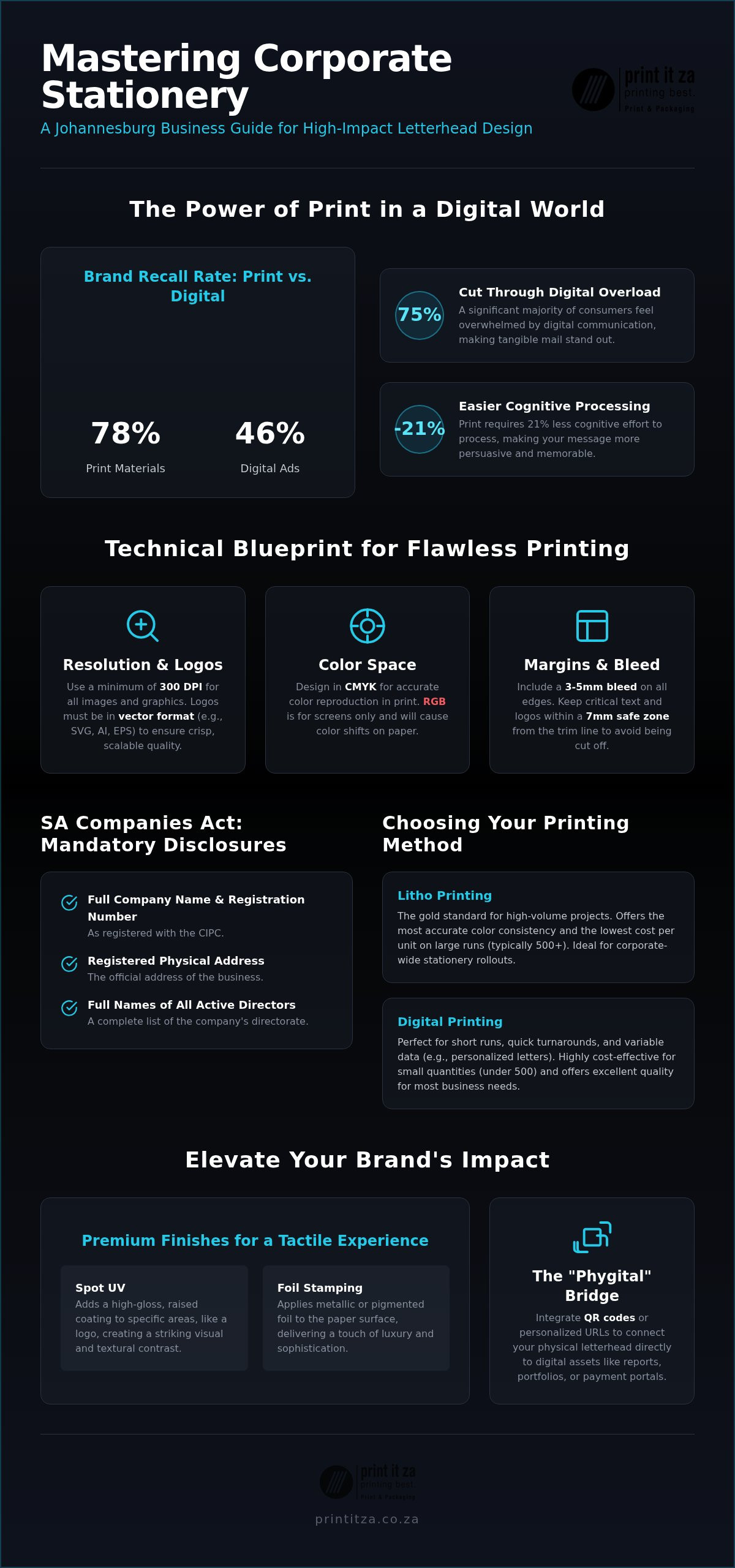
Did you know that print materials achieve a 78% recall rate among consumers, while digital ads often struggle to reach 46%? In a city as competitive as Johannesburg, every physical touchpoint is a chance to outshine the noise. You probably know the frustration of seeing a beautiful digital logo turn into a pixelated mess on a printed page, or the worry that your stationery might not meet the latest South African legal standards. Effective letterhead design isn’t just about placing a logo on a page; it’s about building trust through tactile quality and professional consistency.
We’re here to help you bridge the gap between your digital identity and physical credibility. In this 2026 branding guide, you’ll learn how to master the art of corporate stationery to ensure your brand looks as sharp in a client’s hand as it does on their screen. We will walk you through the technical requirements for 300 DPI high-impact printing and the essential disclosures required by the South African Companies Act. From neo-minimalist trends to cost-effective litho and digital solutions in Gauteng, we’ve got you covered with everything you need to create stationery that truly works for your business.
Key Takeaways
- Learn why physical stationery remains a powerful trust-building asset for Johannesburg businesses in an increasingly digital world.
- Master the technical essentials of professional letterhead design, from CMYK color accuracy to precise bleed and safety margin requirements.
- Navigate the legal landscape with a clear checklist of mandatory company disclosures required by the South African Companies Act.
- Compare the benefits of litho versus digital printing to find the most cost-effective and high-quality solution for your specific project volume.
- Discover how premium finishes like spot UV and foil stamping can transform standard stationery into a high-impact branding tool.
Beyond the Logo: Why Letterhead Design Remains a Strategic Asset in 2026
A professional letterhead is far more than a decorative header on a piece of paper. In 2026, it serves as a sophisticated, multi-sensory brand touchpoint that defines how your business is perceived before a single word of your message is read. If you’re looking for a foundational definition, What is a Letterhead? offers a clear look at its traditional components; however, modern letterhead design has evolved into a strategic tool for establishing trust in Johannesburg’s fast-paced B2B sectors. It’s the first thing a potential partner notices when they open a formal proposal.
We call this the “Digital-Physical Paradox.” While digital communication is faster, physical mail carries significantly more weight today. Research indicates that 75% of people feel digitally overloaded on a daily basis. When a Gauteng executive receives a high-quality, printed document, it cuts through the cluttered inbox noise. It acts as a silent brand ambassador, signaling that your company values precision and longevity. This tangible presence provides a sense of permanence that an email simply cannot replicate, making it an essential asset for any serious corporate identity.
The Psychology of Paper and Print
The feel of the paper and the crispness of the ink directly influence perceived authority and reliability. In corporate Gauteng, the tactile experience of a letterhead can trigger better brand recall than a standard email signature. Studies show that processing print requires 21% less cognitive effort than digital media; this makes your message more persuasive and easier to digest. Brand Consistency is the deliberate alignment of your digital and physical assets to ensure your identity remains unmistakable across every platform. Using high-quality bond paper or textured finishes communicates a commitment to excellence that resonates with high-tier clients.
Letterheads in the 2026 Marketing Mix
Modern stationery now acts as a “phygital” bridge. By integrating QR codes or personalized URLs into your letterhead design, you can instantly direct clients from a physical proposal to a digital annual report or a secure payment portal. This integration is essential for high-value proposals where first impressions are everything. It allows you to track engagement while maintaining the prestige of a physical document. To ensure your stationery meets these high standards, partnering with professional printing services in Midrand allows you to leverage expert litho and digital techniques for a flawless finish. This approach ensures your marketing materials are both modern and deeply rooted in professional tradition.
Technical Standards: Designing for High-Quality Litho and Digital Print
Designing for print is a different beast than designing for digital screens. To ensure your letterhead design translates perfectly from your monitor to a physical sheet, you must master the CMYK color space. Unlike the RGB format used for websites, CMYK ensures your South African brand colors remain accurate and consistent across high-volume litho runs. You also need a minimum resolution of 300 DPI for all graphics to avoid blurry or soft edges. Using vector-based logos is non-negotiable; they allow for infinite scaling without pixelation, which is vital for maintaining a crisp, professional image on every document.
Precision in your layout prevents costly errors during the final trimming process. We require a 3-5mm bleed on all edges to ensure your design extends to the very brink of the paper without leaving white gaps. Additionally, maintaining a 7mm safe zone for all critical text and logos prevents them from being accidentally cut off during the guillotining phase. While these might seem like strict technical rules, even the official U.S. government letterhead standards emphasize such rigour to maintain institutional authority. If you’re unsure how to set up your files, the experts at Print It ZA print and packaging can help you prep your artwork for a flawless finish.
Paper Stock Selection: GSM and Texture
The weight of your paper, measured in GSM (grams per square meter), speaks volumes about your brand’s personality. A standard 80gsm bond is excellent for high-volume, everyday correspondence and keeps your postage costs manageable. However, switching to a 120gsm premium stock provides a substantial, executive feel that immediately impresses a recipient. You should also consider the finish; uncoated stocks are essential if you plan to run these through your office laser printer, as they absorb ink better than coated varieties. For modern SA businesses, choosing FSC-certified papers shows a commitment to sustainability that local clients increasingly value.
Typography for Readability and Impact
Your typography should create a clear, logical hierarchy of information. Your company name or logo should catch the eye first, followed by your primary contact details. Pair a bold font for headers with a clean, sans-serif font for body text to ensure readability across both digital scans and physical copies. Be careful with legal disclaimers in the footer. While they’re required by the South African Companies Act, making them too small can lead to “fill-in” where the ink bleeds and makes the text illegible. Stick to a minimum of 7pt for these fine details to ensure they remain crisp and legal.
DIY AI Tools vs. Professional Design: Making the Right Choice
The allure of “free” or low-cost AI design tools is undeniable. With a few clicks, you can generate a layout in seconds. However, the cost-to-value ratio of these tools often falls short when you consider the long-term impact on your brand. Professional letterhead design is an investment in your company’s credibility. While a DIY tool might save you a few hundred Rand today, the hidden risks of “template fatigue” can make your business blend into the background. In Johannesburg’s competitive B2B landscape, looking exactly like your competitor is a recipe for being forgotten. Professional designers bring a level of technical precision that AI simply cannot replicate, especially when it comes to complex brand guidelines and exact Pantone matching.
We’ve seen this play out at the production stage many times. A client brings in a DIY design that looks great on a screen but fails the moment it hits the press. These files often lack the necessary 3mm bleed or use low-resolution 72 DPI images that appear pixelated when printed. Fixing these technical errors mid-run is expensive and causes unnecessary delays. A professional designer ensures your files are “Print-Ready” from the start, saving you both time and money. They understand how ink interacts with different paper textures, ensuring your corporate colours look exactly as intended, whether you are printing in Midrand or sending a digital PDF to a global partner.
The Limits of AI in Stationery Design
AI tools frequently struggle with the precise alignment required for formal documents. They often fail to leave appropriate margins for South African legal text or hallucinate font pairings that look messy in print. Human oversight is essential for prepress checks. A local designer understands the nuances of our market and ensures your stationery carries an authentic South African voice. They can balance the aesthetic elements with the functional requirements of the South African Companies Act, ensuring your registration numbers and office addresses are perfectly legible without cluttering the page.
Scaling from Startup to Enterprise
As your business grows, your branding must evolve. A simple digital template might work for a solo entrepreneur, but an enterprise requires a cohesive, bespoke identity that works across letterheads, annual reports, and brochures. Transitioning to professional design future-proofs your brand for multi-channel usage. Finding the right print shops in Gauteng is a critical part of this scaling process. These partners help you maintain high standards as your volume increases, moving you from short-run digital prints to high-capacity litho production without losing an ounce of quality. This ensures your brand remains a symbol of reliability as you expand your reach.
Layout Mastery: Essential Elements for South African Businesses
The anatomy of a perfect letterhead design consists of three distinct zones: the header, the body, and the footer. In the modern Gauteng market, your header should immediately establish your identity. Most readers follow an “F-Pattern” when scanning documents, starting at the top-left and moving across before scanning down. By placing your logo and primary contact details in these high-traffic zones, you ensure your brand is recognized instantly. This strategic placement respects the reader’s time and makes your document easy to navigate.
Visual balance is often the result of what you leave out. White space is the secret to a clean, professional aesthetic that doesn’t overwhelm the recipient. When you give your content room to breathe, you signal that your business is calm, organized, and confident. Avoid the temptation to clutter the margins with unnecessary graphics; let the quality of the paper and the crispness of the print do the heavy lifting. A balanced layout ensures that your message remains the focal point while your branding provides a supportive, professional frame.
Legal Compliance: The South African Context
A professional letterhead is a legal document, and in South Africa, compliance is non-negotiable. The South African Companies Act requires specific disclosures to ensure transparency and accountability. For B2B transactions, including your VAT number is also a standard practice that simplifies the procurement process for your clients and builds immediate trust. Use this checklist to verify your compliance:
- Full registered company name as it appears on CIPC documents.
- Company registration number.
- Registered office address.
- Names of directors; remember, if you choose to list one director, you must list all of them.
Modern Branding Elements
Beyond the basics, you can use subtle watermarks or security features to add a layer of authenticity and prestige to your documents. Integrating social media handles and website URLs naturally into your letterhead design bridges the gap between your physical and digital presence. This is also the perfect time to ensure your entire stationery set is aligned. Matching your letterheads with premium business cards creates a cohesive brand experience that sticks in a client’s mind. Consistency across all touchpoints reinforces your reliability and attention to detail.
If you need help aligning your layout with local regulations and high-end aesthetics, you can request a professional design consultation from our Midrand-based team today.
Executive Letterhead Printing with Print It ZA print and packaging
Choosing the right production method is the final piece of the branding puzzle once your letterhead design is ready for the press. Print It ZA print and packaging operates a high-tech facility in Midrand 24 hours a day to ensure your corporate assets never fall behind schedule. We understand the high-energy rhythm of the Johannesburg business scene, which is why we offer end-to-end support from the initial creative development to final delivery. Our strategic location enables us to manage nationwide distribution across South Africa and handle international export requirements for our global partners with ease.
To truly differentiate your brand, we recommend exploring premium finishes that add a tactile dimension to your stationery. Techniques like spot UV and foil stamping transform a standard sheet into an executive tool that commands attention. Print It ZA print and packaging specializes in these high-end applications, ensuring that every touchpoint with your client feels intentional and prestigious. These finishes work alongside the layout mastery we’ve covered to build a sense of permanence and reliability in a crowded market.
High-Volume Litho for Corporate Efficiency
For large-scale corporate requirements, litho printing remains the gold standard for efficiency and quality. If your firm frequently sends out physical correspondence and needs 10,000 sheets or more, litho provides the best cost-per-unit advantages in the South African market. One of the most critical benefits is the precise Pantone matching we offer. We ensure your specific brand colors are reproduced with absolute consistency across the entire run, so your identity never looks faded or off-brand. This reliability is essential for maintaining high standards in high-volume environments where every sheet must be identical.
Short-Run Digital for Agile Branding
Digital printing provides the necessary flexibility for small teams, startups, or specific marketing events. You aren’t tied down by massive minimum order quantities, allowing you to stay agile as your business evolves. Digital technology also facilitates personalization through variable data printing, which is a powerful tool for direct mail campaigns that need a human touch. Whether you need a quick top-up of your supplies or a specialized run for a new product launch, our digital solutions deliver speed and precision without the long setup times of traditional methods. Contact Print It ZA print and packaging for a custom letterhead quote to discover how our Midrand team can elevate your professional stationery with high-impact results.
Secure Your Professional Edge for 2026
Navigating the complexities of professional stationery requires a blend of technical rigour and strategic branding. From mastering the CMYK colour space to ensuring full compliance with the South African Companies Act, every detail of your letterhead design serves to reinforce your authority in a competitive market. As we’ve explored, the tangible weight of high-quality print creates a level of trust that digital channels often struggle to match, providing a permanent anchor for your corporate identity.
Our team is here to ensure that your transition from digital concept to physical reality is seamless and stress-free. With our in-house creative design team based in Midrand and our 24/7 production capabilities, we handle your most urgent rebranding projects with speed and precision. Whether you are distributing locally in Gauteng or require nationwide delivery across South Africa, we provide the dependable partnership you need to stay ahead. It’s time to let your stationery do the talking and leave a lasting impression on every client.
Elevate Your Brand with Professional Letterhead Design & Print at Print It ZA print and packaging
Frequently Asked Questions
What information is legally required on a South African letterhead?
In accordance with the South African Companies Act, you must include your full registered company name, your registration number, and your registered office address. If you choose to list the names of your directors, you are legally required to list all of them. Including your VAT number is also standard for B2B transparency. These details ensure your business remains compliant and builds immediate trust with your local partners and clients.
What is the best paper weight (GSM) for a professional letterhead?
For a balance of quality and cost, 100gsm to 120gsm is the ideal choice for an executive feel. While 80gsm is the standard for high-volume, everyday correspondence, the heavier stock provides a more substantial, premium touch that impresses recipients. It’s important to choose an uncoated stock if you plan to use an office laser printer, as this ensures the ink absorbs properly without smudging or jamming your machine.
Can I use a digital letterhead for physical printing?
You can, but it requires careful technical preparation to avoid poor results. Digital files are often 72 DPI, which looks crisp on a screen but pixelated when printed. For professional physical output, your file must be at least 300 DPI and include a 3mm bleed. We recommend using vector-based logos within your letterhead design to ensure everything remains sharp. Converting your file from RGB to CMYK is also essential for accurate color reproduction.
What is the difference between litho and digital printing for stationery?
Litho printing is the gold standard for high-volume runs, offering superior Pantone color matching and a lower cost-per-unit for quantities over 1,000. Digital printing is much better for short runs and small teams, providing fast turnaround times and the flexibility of variable data. While digital is cost-effective for small batches, litho remains the preferred choice for large South African firms that demand absolute color consistency across thousands of sheets.
How much bleed should I include in my letterhead design?
You should include a minimum of 3mm to 5mm of bleed on all edges of your artwork. This extra space allows your design to extend beyond the trim line, ensuring there are no unsightly white gaps after the paper is cut. Additionally, maintain a 7mm safe zone for all text and logos. This technical precision is a hallmark of high-quality letterhead design, ensuring your final product looks professional and perfectly centered every time.
How do I ensure my brand colours look the same in print as on screen?
To achieve color accuracy, you must design your files in the CMYK color space rather than RGB. Screens use light to create color, while printers use ink, which often leads to a shift in vibrancy. For absolute precision, we recommend using specific Pantone matching, especially during high-volume litho runs. Our in-house team can help you calibrate your files to ensure your South African brand identity remains consistent across all physical and digital touchpoints.
Is it worth adding special finishes like embossing to my letterhead?
Adding special finishes like embossing, foil stamping, or spot UV is highly effective for premium branding. These tactile elements turn a standard document into a high-impact asset that signals prestige and authority. While these finishes increase the initial production cost, the return on investment comes from the immediate trust and professional standing they build with high-value clients. It’s an excellent way to differentiate your business in Johannesburg’s competitive corporate landscape.
How quickly can I get letterheads printed in Johannesburg?
We provide fast turnaround times through our 24/7 operational facility in Midrand. Depending on the complexity of your project and the volume required, we can often complete short-run digital projects within a few business days. High-volume litho runs may take slightly longer due to the setup process. Our central location allows for efficient nationwide delivery, ensuring your business stays stocked with professional stationery without any long or unnecessary delays.